 As Nancy Geyer points out in this thoughtful comment, Ithaca is indeed "inundated with uninspired landscape paintings"; she also points to a similar problem with with landscape photography. Worksoften not very well donedo look as if they "could have been painted centuries ago". Since I agree that this an issue (and not just here, I've seen similar work living in Boston), let me offer a few ideas, not all of them specific to the problem of landscape. Also, these may be slanted more towards painting and drawing (my own focus as an artist), than photography or other media. The point is to suggest alternatives to cliche.
*Artists should be aware of art history. This means both breadth and depth. They should look at what artists from a wide range of times and places have done, and have some sense of how it all interrelates. However, it is also important to look closer at thingsartists, styles, movements, techniquesthat you find particularly interesting or useful. This is important for everyone, but perhaps particularly for those who see themselves as traditionalists. Being a traditionalist without (fully) understanding the tradition in question is a big problem, often leading to bodies of work that are confused and directionless (and boring).
*Artists should be familiar with a wide range of contemporary art. Obviously, this doesn't mean simply looking to jump on whatever the latest bandwagon is, nor does it mean uncritical approval. It does mean being aware of what your options are. It generally doesn't make much sense to just pick a date and say that nothing that developed after that is any good (unless you really know what you're talking about, which is rare). Travel, read, go to schooldo what you have to do.
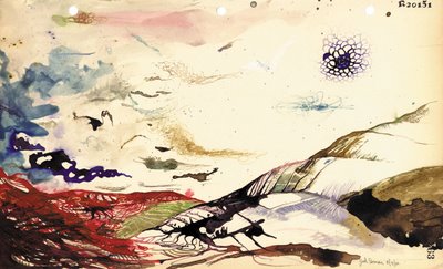
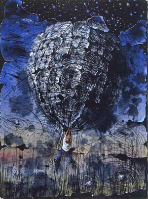
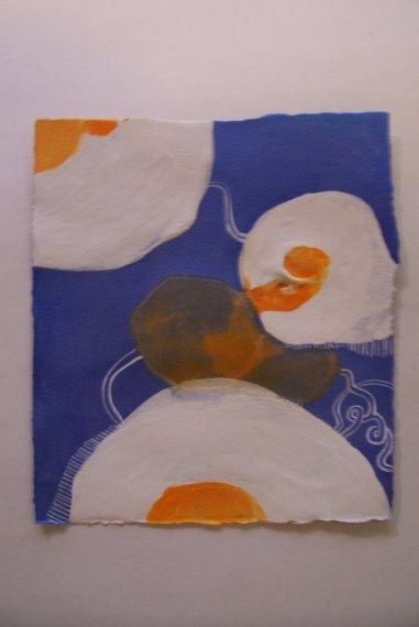
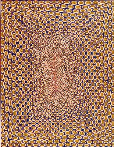
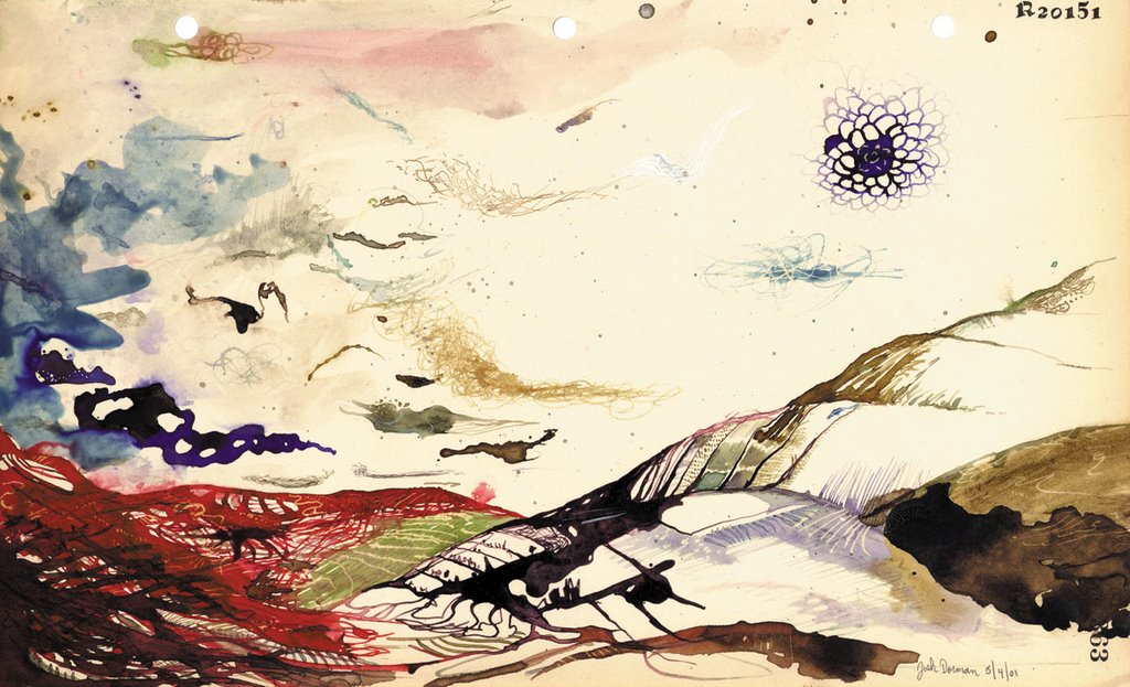
*Look at the connection between landscape and abstraction. Many if not most of the early abstractionists (Mondrian, Kandinsky, Klee, O'Keefe, many others) developed this direction out of earlier work in landscape. You can see precursors of this approach in earlier landscape paintingfor example the work of J.M.W. Turner. Landscape can take us away from our usual sense of scale, away from the world of familiar people and objects. It can be macroscopic or microscopic. It can incorporate distortions, other ways of seeing and depicting. NYC artist Josh Dorman (more pictures here and here) does all of this ingeniously. Also worth paying attention to are locals Barbara Mink and (more interestingly) Barbara Page.
*Landscape doesn't have to be pastoral. Cataclysm and chaos are a big part of the natural world. Likewise, violence is central to our culture (and others as well). Local printmaker Craig Mains (see my last post) is a good example, as is (my former teacher) painter Gerry Bergstein (more information and pictures here and here), sculptor Heide Fasnacht, as well as (again) Turner.
*Landscape isn't just natural landscape. It should go without saying that we are constantly surrounded by man-made things, even in the countryside. The interweaving of the natural and the artificial (even to the point where these categories can become blurred) is a particularly interesting subject.
I'm not a art teacher, so I don't have any clear ideas about what should be done in this field. Although I do think traditional techniques and approaches should be taught, I don't think its a good idea to simply pretend that we're living in the nineteenth century.
Labels: barbara mink, gerry bergstein, ithaca, josh dorman, painting
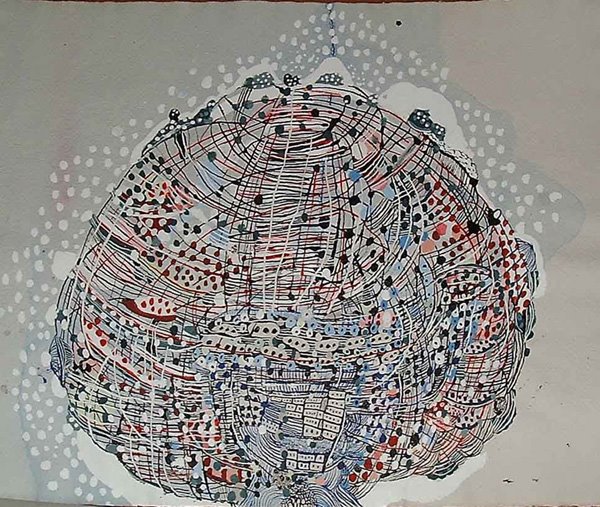
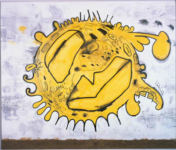 Carroll Dunham, Solar Eruption
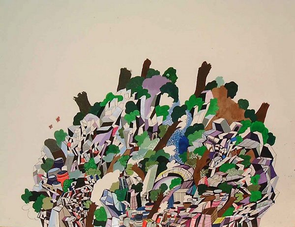
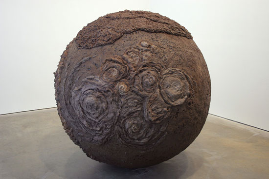 Roxy Paine, Bad Planet
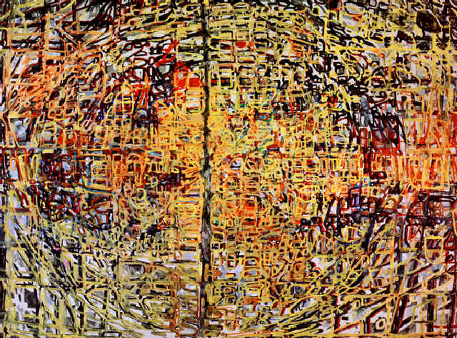
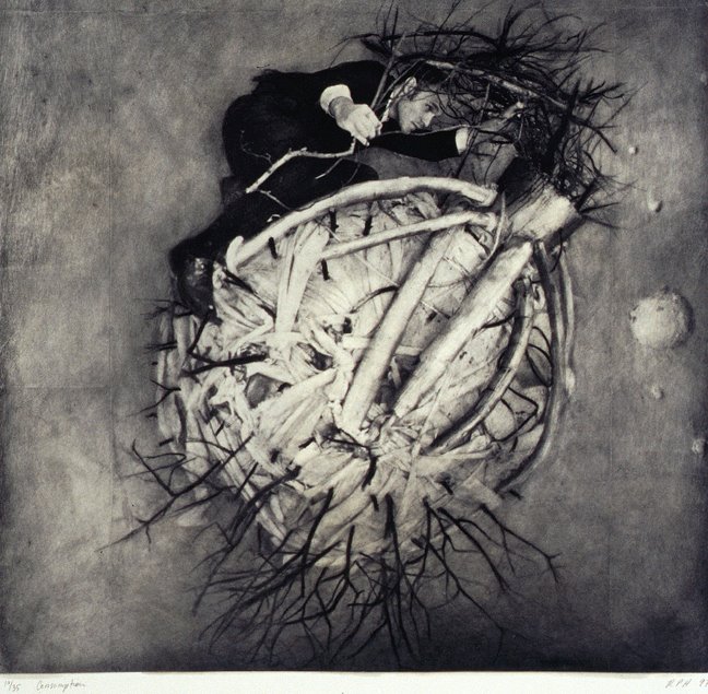 Robert and Shana ParkeHarrison, Consumption
 Pieter Bruegel, The Tower of Babel
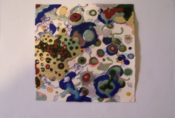


