Wednesday, May 07, 2008

ramayana

Indian, Madhya Pradesh, Datia, Rama’s Army Attacks Ravana’s Demon Army, page from a Ramayana, 1595, opaque watercolors and gold on paper, 28 x 19 cm.

From the Times, a long one:
Together with the Mahabarata, the Ramayana is one of the great folk epics of Hindu culture. By legend, it is commonly ascribed to the Indian writer-sage Valmiki. Although its precise date of origin is unknown, it is thought by scholars to be over 2,000 years old. The original Sanskrit text is spread throughout the country and throughout Southeast Asia, often in altered versions. There it profoundly influenced the arts and the common culture. It combines moral and spiritual guidance with a story of high adventure that is both engrossing and, ultimately, tragic.

In seven books, Valmiki's Ramayana covers the life of Rama, who is said to be an incarnation of the god Vishnu. Upon losing his kingship amidst familial conflict, he leaves his city of Ayodhya and takes to voluntary exile in the woods. There he is joined by his ever-faithful wife, Sita. Sita however is soon abducted by the demon-king Ravana, who imprisons her in the city of Lanka. After enlisting the help of the monkey-man general Hanuman, and his simian troops, and after much violent struggle, he is able to take the city and liberate his wife. Although this should be a happy ending, further complications ensue, with unfortunate results.

Up now at the Johnson Museum, "Ramayana in the Arts of India and Southeast Asia" contains some stunning work. As befits it modest (by museum standards) scale, the show focuses on a relatively narrow geographic and historical range. Middle-Eastern influenced miniature paintings from India are one emphasis. A stylistically distinct body of work — paintings and shadow puppets — coming from the south of the subcontinent is another. A group of 20th century folk textiles from Bali make up a third focus. Other locales get only token representation. And although artists have been illustrating the Ramayana for much longer, the majority of work here comes from the last 300 years or so.

The first of these contains the best art here. As their size and proportions might indicate, these miniatures originate as book or album pages. They are colored in opaque watercolor, often with the addition of gold. Bookended by the rise of the Islamic Mughal Empire (16th though 19th century) and the 19th century institution of Western-style oil painting by the British colonialists, they represent a period of great accomplishment in Indian painting. Characteristic is a stylistic syncretism and the proliferation of distinctive regional and court-based approaches. For shear refinement and sophistication, the work is hard to beat.

Hanuman Sets Fire to the Golden City of Lanka (early 19th century) is a particularly striking example. To give the back-story, the monkey-general has travelled to the mythic island city (in present-day Sri-Lanka) to contact Sita. He does so successfully, but is then found out. Ravana wishes to kill Hanuman, but his moral code prohibits doing this to a mere messenger. Instead, he sets his tail on fire. In revenge, Hanuman goes around the city, setting flames, before finally escaping to rejoin Rama on the mainland.

The painting is ingeniously composed and ambiguous in its perspective. It is horizontally oriented and contains three sharply divided sections. To the right is the polygonal city, mainly colored pale and indian yellow. Its thick outer walls are as if squashed flat across the ground. Inside: a maze of buildings and doors, archways, demons, scattered purple flames rendered translucently. In the middle is an curvaceous expanse of pea-soup-green. It narrows towards the left; near the tip of the mini-penisula a light-skinned Hanuman stands in profile. He steps forward but faces back, his flaming tail echoing its handiwork. To the left is the dark blue sea covered in white swirls — abstracted waves. The combination of broad areas of flat color, with fine details rendered less opaquely is effective.

Lanka and it surrounds are also the setting for Rama's Army Attacks Ravana's Demon Army (1595). The vertical miniature uses a more naturalistic perspective than Hanuman. The city — here covered all-over in real gold, with black lines — stands against the top edge of the page, indicating its distance. In front rages a wild battle, the two sides facing each other wielding bows, swords, shields, and spears. In the lower left corner are Rama (blue skin) and his younger brother Lakshmana (light-skinned). Their postures and orange bows echo each other. Fighting with them is Hanuman's monkey army, each also blue or light. Facing them from the right of the page is a heterogeneously hued crew of horned demons. Together, the figures form a dense, rhythmic tangle. A cloud of white, in places quite translucent, surround the fighters.

The painting contains a variety of stylistic tendencies, ranging from the somewhat stiff line drawing of the city to the fluid outlines and painterliness of the rocks and foliage setting the city off from the combatants.

Three paintings from the south of India (all 19th century) show a more direct approach. Their style, which is quite uniform, is characterized by an all-over flatness and the prominent use of black outlining. Characters (excepting a multi-headed Ravana in one scene) are seen in profile. There is an ample use of bands, stripes, and various architectural motifs to structure the compositions. Forms occluding others give the only hint of depth.

A similarly blunt, dark-outlined style can be found in the numerous South Indian shadow puppets. Made of animal hide, and mounted through the center on wooden rods, they are substantially larger than the paintings. Each is punctured by cutout holes.

The most striking of these are arranged a long display. Each one is a major Ramayana character. Elevated a few feet from the ground, they match human height. With two exceptions, the colors are bold (but not garish). Rama, for one, has dark turquoise skin. The bad guys, Ravana and Kumbhakarna (his brother), are more subtle: mostly red with black, and white details. The former has eight heads rather than his characteristic 10 and again breaks from the usual profile. The latter's giant stature is indicated by his over-scaled head. In most of these puppets, the patterning is rich, with exuberant stripes, swirls, and bursts. Dense filigrees of holes help the puppets stand out, along with the (somewhat harsh) fluorescent under-lighting.

Another Indian puppet (20th century), shows Sita crouched amidst leaves, snakes, and birds. Notably, it depicts a specific scene rather than just a character. It is also unique for its lack of joints. Although its inside cutouts are delightfully intricate, the overall shape is rather formless.

For comparison, she is hung next to a Javanese Shadow Puppet of Hanuman. The stylistic contrast is sharp. Hanuman is covered head to toe in gold, with sinuous details in red, white, and black. His limbs are skinny and project in an angular manner. The decorative detailing - painted and cut - is particularly intricate. The face is wildly mannered. In further contrast to the flatness of the South Indian styles, shading appears in the form of feathery black marks around the edges of the limbs.

The Balinese embroidered cloths here may be familiar to Johnson visitors from "The Story Cloths of Bali," a show from early 2006. They represent the scholarly and collection efforts of Joseph Fischer, who has written a useful and accessible book with the same title as that exhibit (copyright 2004). According to him, the works originate from the Balinese regions of Jembrana and Buleleng, and in particular from the city of Negara, in the former district. Often they involve collaboration between a man, who selects traditional subjects and renders them in pencil outline, and a woman, who chooses the colors and does the actual embroidery. The finished pieces are used in a variety of Hindu rituals, often alongside other art-forms such as dance, architecture, and painting. Sadly, Fischer reports that the tradition is now moribund, having faded during his researches of the nineties.

Although one piece features a red background, most feature plain, off-white cotton backings, to which colored cotton thread has been applied. The threads sometimes veer towards the garish and the synthetic-looking — even iridescent colors. This is a difficult tightrope to walk when surrounded by so much classical restraint and some areas don't quite pull it off. (The 2006 show featured even more over-the-top work.) A variety of embroidery techniques are used, resulting in a richly expressive array of textures. Faces are typically rendered in outlines, while bodies and other forms are made up of solid or sketchy color-areas. Personages are labeled with Roman letters.

A scattering of sculptures from otherwise unrepresented regions round out the show. Their inclusion feels a bit teasing; still, some pieces are impressive. A pair of tall, carved wooden doors is a standout amongst these. Thai or Cambodian, each door shows a combatant: Hanuman on the left and Ravana on the right, facing each other. Their detailed armor makes them look flat and a bit stiff. This is in contrast to the more dimensional, life-like character of the animals occupying smaller sections below each. The doors were originally gilded gold and a dusting towards the door-tops remains.

Given its relatively modest ambitions, "Ramayana in the Arts of India and Southeast Asia" is a success. It features some highly impressive work — some of the miniature-paintings in particular — and it offers a compelling and accessible entryway into a rich subject.

Labels: , , ,

Sunday, March 30, 2008

main spring

Buzz Spector, Creeley's Creeleys, Internal Dye Diffusion Print (Polaroid), 36.75" x 24"

Kumi Korf, Birds in Conversation, Gold, Intaglio Print on Japanese Paper, 36" x 20"

Victoria Romanoff, The Oysters of Le Havre, Paper Mosaic

Jeremiah Donovan, Walnut Bowl Inside/Out, Earthenware Clay layered with Terrasigilatta and Raku Glazes (Multi-Fired), 12" x 14"


A version of my review appearing in the Times, 3/19/08 (which I can't find online):
The Main Street Gallery's annual spring show covers an eclectic range of styles and mediums with an emphasis on local artists. The show has been markedly strong in recent years (particularly relative to similar efforts by other area galleries) and this year's feels particularly so.

Cornell professor Buzz Spector's Creeley's Creeleys exemplifies his recent large format Polaroid work as well as his use of books as brick-like sculptural units. The bricks here come from the collection of the late poet Robert Creeley and collectively form an oblique, associative portrait. The volumes vary richly in color, design, and typography; some include author photos. They are arranged in a roughly circular cluster of small stacks (some clearly showing different editions of the same book). The stacks zig-zag — facing in different directions — and grow taller towards the back. They sit on rough, unpainted floorboards which emphasize the picture's deep perspective. (As does the contrasting flatness of scattered volumes placed upright, more or less parallel to the picture-plane, as if in a bookstore display) The image itself is sensuous with subtle contrasting tones and artful blurring along the top and bottom edges.

Birds in Conversation, Gold, by Ithacan Kumi Korf, is another standout. The tall intaglio print belongs to a recent series in which she attempts to provide an abstract analogue for the experience of flight. Like others, this one features a flock of flatly painted, hard-edged shapes arranged against a brushy, gestural background. In Gold there are three. Moving from top to bottom, left to right and then back left: a warm grayish-blue one most resembling a bird in profile (wings closed), a burnt orange amoeba, and a red one suggesting a kite or an arrow. These are tied together by curving green line suggesting a flight line or a thread. These stick sharply out of a ground of indian yellow, printed over silver onto a thin tan-colored Japanese paper sheet.

Korf's long-standing print collaborator is Ink Shop master-printer Christa Wolf. Wolf herself is well-represented here by the monotype landscape Alegretto. The piece loosely depicts a view of the landscape surrounding her upstate NY farmhouse. The piece is arranged in vertical tiers of wave-like, gestural marks barely hinting at perspective. The bottom half is dominated by a pair of dark purple-brown tree trunks, gnarly and with bare branches leaping out sideways. The brushing reveals the white of the paper. The colors -- mostly greens with small patches of reddish brown --are faintly iridescent.

Victoria Romanoff (another well-known Ithacan), offers an engaging collage-painting, The Oysters of Le Havre. The bits that make up this "paper mosaic" fit each other snugly without overlapping. Although the scene is fragmented and filled with abstract mark-making, it is recognizable as a landscape with a shoreline. A relatively empty horizontal bar towards the top is warm gray (apparently sprayed) and indicates sky. Marks elsewhere are predominantly whitish — pink and blue — and applied via thick and thin paint and with chalk or crayon. The whole vista is surrounded by a pink painted border, relatively dark, but tied to the rest through similar marks.

The inclusion of functional pottery is a distinguishing characteristic of the Main Street's group shows; included here are the decoratively glazed vessels of Anna Velkoff Freeman — two tall cups and a wide, shallow bowl. The white on dark blue designs are stylized depictions of dangerous microbes. The inclusion of the foodborne e coli (on the bowl and one of the cups) is a cheap joke but their sinuous tendrils do form interesting patterns.

Much more interesting sculpturally are three asymmetric goblet-like bowls by the Groton native Jeremiah Donovan. They are inspired by the forms — interior and exterior — of walnuts, and their jagged inner ridges and staggered, uneven rims limit their functionality. Colors are copper brown and greenish. The outside edges (along with parts of the inside) are rough, covered in scored lines and accreted dirt clumps.

The least satisfying mode of art on display here is a figural, narrative surrealist sculpture based on an assemblage aesthetic. By far the strongest work in this vain is Gail Hoffman's Messenger, a bird-headed figurine welded together from cast bronze fragments. Included are casts from real objects, e.g. a leaf wing and a doily covering its chest. In comparison, Claire Harootunian's Angel Mine and Lead On look rather slight. Both feature tiny, minimally altered dolls sitting atop benches: clay and painted wood, respectively.

"Spring Group Exhibition" will be of greatest interest to those already familiar with the works of the artists shown. The particular style of combining well-known area artists with select (and perennial) "outsiders" is idiosyncratic to the Main Street. Visitors from past years should feel an engaging tension between the expected and the new, as different aspects of artists' work are (often slowly!) revealed.

Labels: , , , , ,

Wednesday, January 16, 2008

states of the art

Times:
"States of Identity: Real or Imagined" is the State of the Art Gallery's contribution to the upcoming Light in Winter Festival. As usual, it features gallery members weighing in on a loosely-defined theme. This year's theme is "identity." Although this may have served as a jumping-off point for the artists, it doesn't work as much of a guidepost for the viewer.

"States" does have a mood distinct from most SOAG group shows. While carefully observed realism often acts as an anchor, the work here is more experimental. There are a few traditionally figurative paintings scattered about; however, they are not among the strongest works here. In keeping with the hybrid and high-tech character of LiW, mixed-media, collage, and digital imaging rule. The human figure portrayed literally or by analogy is common, as is the natural and built environment presented in unfamiliar and awe-inspiring ways.

Not surprisingly, LiW founder-director Barbara Mink is well-represented. Her three large mixed-media acrylic canvases are standout works, full of her rich geologically-inspired painterly textures. These pieces are new terrain for Mink, as they incorporate collage and portraiture into her signature style. The monochrome faces are printed via photo-transfer. There is some awkwardness in the way they are juxtaposed with the paint. The familiar, intimate forms don't always sit well with the awesome expanses of color.

Black Angels is the most resolved painting in this regard and the best overall. The center is dominated by a black-printed face shown in three-quarter view a portrait of the artist as a young woman. Another artist-head, frontal and less visible, hides in the lower right corner. The piece works so well because the blackness framing the angels is echoed throughout as contour-lines and shadowy patches. Portraiture dissolves into abstract landscape. The background is composed of patches of rich and varied color, particularly turquoise. Angels is named after a string quartet by avant-garde composer George Crumb and incorporates appropriate sheet music.

Grotto is of the same size and proportion and also features a pair of Mink's, this time blending in more. The dark, earthy colors are covered with patches of dark turquoise and thick golden powder. The square shaped Old Country places the face of a white bearded ancestor in a sunken, shrine-like enclosure.

Ethel Vrana is also working with an abstraction inspired by the natural world. The acrylic Event-Particles indeed evokes a microcosm. A loose, branching grid of yellow lines covers a green ground and is itself covered by a cloud of copper. The overall texture is dense and lively with layering, scratches, and air bubbles. A cluster of shiny black droplets hovers near the center. It resembles a living system.

Photographer Jan Kather shows a series of lenticular photographs (the surface is a grid of tiny lenses). Depending on where you stand, you can see either one of two images one astronomical and one earthly or some combination of both. The images are iridescent and mesmerizing. Ausable Eddy Galaxy is particularly compelling. A marble-like maelstrom in black and white is juxtaposed with a pink cloudburst in the darkness of outer space. Central Park Galaxy combines similar astronomy with a blurry nighttime skyline, the park a strip in the foreground.

Carol Ast, long respected for her carefully rendered pastel landscapes, has been trying out new directions recently. Here, she has collages featuring diverse and unexpected combinations of media. Inunnguaq: In the Likeness of a Human: Inuit is on paper. It shows a dark stone monolith rendered in what looks like thick paint, set against a desolate pink pastel expanse. Remarkably enough, the pile is actually made of clay. Ast used regular clay as a top layer with paper clay in the middle acting as a kind of glue (containing as it does both materials). I assume this is a viable technique but the result appears somewhat unwieldy. Still, it is a striking image. Autobiography combines torn paper scraps including fragments of her landscape pastels and bits in silver with dried plant material and energetic pastel strokes.

This Ole House, a digital photograph by David Watkins Jr., shows a decrepit wooden house. The building is at a moderate distance, near the top of the page. Sloping upwards towards it is a swampy landscape filled with barren trees and branches. The dull, wintery colors are punctuated by the green of grass and the red of a brick chimney. The piece hangs in the middle of a row of five prints; each of the others shows an exterior detail of the ruin. Many show corners. It is up to the viewer to construct a whole from the evocative fragments. The borders of the images are uneven which gives them a weathered feel similar to their subject.
A correction: the central image in Black Angels is not Barbara Mink but her daughter (the corner image is Barbara). In Grotto, the top image is the artist.

Labels: , , , , , , ,

Saturday, November 17, 2007

rise and fall

This past Thursday evening, I attended the Cornell screening of a rough cut of a documentary film by Long Islander Jake Gorst. It is entitled The Rise and Fall of Books and is being planned for PBS. (See Wylie Schwartz's piece in this week's Times.) Its title is somewhat misleading, since the main subject is really Cornell professor Buzz Spectorthe man and artistalong with his recent book installation project, the "Big Red C."

I prefer to think of the "C" as an abstract, monumental arc. (C for Cornell? Or for "community," as someone suggested at the screening? This seems like a contrived jingoism and besides, the piece didn't even feel that much letter-like on-site). The piece was made up of over 800 books, all of them supposedly the work of Cornell humanists
professors, students, or alumni. Shapes and subjects ranged from children's books and coffee-table science books to classics (with new introductions) and ponderous-looking theoretical texts (reference). The shape was like a curved staircase: almost touching the floor on one end, the height of a child on the other.

Spector and a group of students constructed the form in a Cornell-owned building in Chelsea during the second week of January this year. The piece was rebuilt on-campus (using the same bo
oks) for an April exhibition. I saw it then at the Kroch Library and I liked it, despite my unease with some its symbolic aspects. (Disclosure: Buzz has been very friendly to me, which is impressive given our relative statures.)

The film was indeed rough, full of awkwardness that could be resolved by better pacing and arrangement. It centers around footage Gorst had shot with the intention of merely documenting the piece and its initial construction in NYC. But Gorst soon realized that he had the makings of a feature length film and so he went for it. The movie also features Buzz interviewed in his office (at Cornell, I believe) talking about some of his past work and how it related to his biography. These segments could be fleshed out and better integrated. Indeed, Gorst told the seated audience that he plans to do another interview.

Buzz as long worked with books, "both as subject and as object." As well as piling books and photographing them, he has worked extensively in altered books. One piece shown in the film was a book from which pages had been carefully torn
nearly the whole first page was missing, with more and more of the page present as one goes through the book. It seems clear to me at least that this is a man as in love with his medium as any painter.

He spoke movingly of his works relation to his biography (perhaps working against his stereotype has a cold, cerebral artist). He spoke of his mother's disapproval of him making art out of damaged books and how she eventually came around after recalling a childhood incident in which he sat by the waterside arranging stones to trace the lines made by the receding waves. He and she both saw an intimate connection between this and his mature artistic expression.

Although not quite justifying the title, he argues for the continuing value of the printed word in an increasingly digital world. He explains that some forms of printed literature will disappear, for example the phone book. But others, such as novels and books of poetry will prevail. The case is made largely based on a emotional appeal to appreciation for the mate
rial and tactile aspects of reading. There were, however, some suggestions that younger generations might not be as appreciative. A longtime friend of Buzz's (whose name I forget, and who is identified vaguely as a "writer") emphasizes the old-fogginess of this perspective. A child at the opening for the C carries what looks like a hand-held video game.

Buzz is also enchanted by analog photography. He owns an impressive large-format Polaroid camera, which he uses to photograph his installations. In Rise, he compares the materiality of the resulting prints to painting. These he considers art (you would to, if you saw them in the flesh) as opposed to the numerous digital shots, which are mere documentation.

The main focus of Rise however, was Spector and his students in downtown Manhattan. They drive around in a van, unpack boxes, sort and arrange books. There is a time lapse sequence in which the sculpture is put together in a minute or two. There are brief interviews with a handful of students, some of them awkward or annoying, others endearing. Some bits seemed to drag on too long or felt out of place, but again, this is a matter of arrangement. The basic material is strong.

The film features a rocking soundtrack by dB's, which effectively conveys the feeling of being young (or young at heart, to use the cliche) in the big city. Some of the songs were newly written for the project. As Buzz explained after the screening, he had designed early album art for their predecessor group, the Sneakers back in the 70's. Their involvement in the documentary was a lovely coincidence. Unfortunately, the music was less suited for some of the more reflective moments.

As I mentioned in the discussion following the screening, my main difficulty was the exclusion of Cornell University as subject. The sense given by the film was Buzz playing hooky with his students in the big city, which is all well and good as far as it goes. It might come off as square or boring to mention the institutional connection. But it does seem awfully willful to ignore the facts: the project was planned by a Cornell prof (formally the director of the art department, now on leave), executed by Cornell students for credit, built out of Cornell books, and presumably funded by university funds. We see an alumni studded reception at the end of the film. Ostensibly, the piece represents the unity of humanities scholarship at Cornell (I'm not sure that I buy this either though). I can understand how personal artistic goals and connection with students are more interesting and important than all of this. Certainly, non-Cornellians like me and Gorst are most likely to latch on to such aspects. But still, it does seem willful. I spoke with Buzz a bit after the event and he did seem receptive to my comments.

UPDATE (11/19/07): Buzz tells me that he in fact rents the camera (of which only around 15 exist) from the Polaroid 20X24 Studio in New York. Apologies. Also, the "writer" mentioned above is Reagan Upshaw, a New York poet and art dealer.

Labels: , , , , , ,

Wednesday, November 14, 2007

wakon yousai


For the Times, not a review:
Wakon Yousai is somewhat unusual for the Upstairs Gallery, where painting is the usual focus. The exhibit highlights the rough, elegant ceramic vessels of local artist Momoko Takeshita Keane. Complementing these are two miniature tabletop “gardens” by her husband Marc, a landscape architect and a writer. The work mixes cultural influences: Japanese and Western, traditional and modern, craft and fine art. The show’s title is a pun on a 19th century Japanese expression expressing the goal of reconciling traditional values with the new Western technologies. In the Keanes’ version, the phrase—pronounced the same way but with two out of the four kanji characters changed—takes on a related but different meaning: Japanese “roots” combined with western “color”. The literal colors though are traditional: earthy and restrained.

I recently spoke with both artists at the gallery. Momoko’s English was limited, so much of the time, Marc spoke on her behalf. Our conversation was informal and meandering; the following is an attempt to distill the most relevant parts.

Both artists have deep roots in the culture and aesthetics of Japan. Momoko was born in Kyoto and studied her craft there and in the well-known Japanese pottery town of Shigaraki. Most of her teachers and peers were men. Eventually she set up a studio business in Kyoto. Marc spent a period of eighteen years studying and working in Japan, where he met and married Momoko. In 2002, he took a one-year teaching position at Cornell. The couple moved to Ithaca, along with their son. They were planning to go back but they liked it enough to stay. About two years ago, they completed a studio where Momoko now works. Importantly, this is her first solo show since then.

Momoko has found the change valuable. She stresses the greater openness and “exchange of information” (Marc’s term) among the local art community. In Kyoto, the system was rigid and hierarchical, with masters and apprentices. Here things are more fluid. There is less pressure here to stay within a medium, something borne out here by a group of small crocheted copper wire bracelets. There is also less pressure to make functional pieces, as a grouping of doll-sized clay jackets hints. But both artists also stress the ongoing importance of Japanese skill and knowledge for their work.

Her technique is largely traditional, typically involving coil-building and firing over several days in a wood-fired kiln. She is a traditionalist when it comes to materials too. There is little glazing in her work here, although the ashes from the firing give the pieces different patterns in browns and grays. She also prefers the rough, minimally processed quality of traditional Japanese clay. We spoke about the difficulties of finding similar materials from the northeastern United States.

This show has been an opportunity for Momoko. The onion shaped Scarf Vase 1 is tan and reddish brown in color. A pair of small, drop-like ash markings huddle together on one side, highlighted in cool, shiny white. Its size is typical of the work in the show, roughly the size of a basketball. Like many of her pieces here, it has a sculpted scarf wrapped around its neck, an anthropomorphic feature Momoko describes as a feminine touch.

The piece was recently purchased for the Johnson Museum, where it will join an excellent collection of Asian objects. Both the museum director Franklin Robinson and the Asian Art curator Ellen Avril were at the opening on the 30th of October. Avril saw the piece and thought the museum should purchase it. A couple, Bob and Kazuko Smith—acquaintances of the Keanes and established donors—stepped in and bought the piece directly for the museum, sidestepping the usual complicated acquisitions process.

Marc’s work here has a supporting role. He refers to his tabletop gardens as bontei, “tray gardens." The two pieces feel cramped and awkward in the gallery space. The Ploughman’s Dream II is the more impressive of the two. Encased in a a circular steel stray is a microcosmic landscape divided by a wavy clay wall. One side is inlayed with long, precisely cut slate blocks arranged in rows. The other side is oak bark. According to Marc, the piece is meant to represent a dialectic of wild versus cultivated furrowing. His other tray piece echoes traditional Japanese rock gardens and is framed in wood. He too spoke of his working method, which involves improvising with found materials.

Also by Marc is a series of clay kanji, attached to irrregular, plate-like forms. These he made in Momoko’s studio.The intent was to make the characters fluid and expressive, more like ink or paint than clay. He plans to make more, enough to spell out sentences. These he tells me are a purely modern invention, without historical precedent.
Below: Scarf Vase


Labels: , , , ,

Tuesday, June 26, 2007

sleepwalking

A local art theft case! As reported in today's Ithaca Journal, a plaster cast replica of the Roman sculpture Sleeping Ariadne (owned by the Vatican) was stolen from Cornell's Sibley Hall some time over this past weekend. It was found missing 7:27 yesterday morning. According to the article, "the only evidence police have found relating to the suspected theft is a trail of plaster leading out of the building to a parking lot between Sibley and Rand Halls". The piece is estimated to be worth "between $5,000 and $20,000". It was purchased by Cornell in the 1890's alongside other ancient Greco-Roman simulacraby the university's first president, Andrew Dickson White. This essay has some general historical background.

UPDATE (07/03): They found it:

Investigators from the Cornell University Police Department have recovered "Sleeping Ariadne," an irreplaceable, 350-pound plaster of Paris sculpture that was taken from Sibley Hall over the June 23-24 weekend. Cornell Police recovered the statue from an off-campus fraternity house about 9 a.m. June 28.

There was slight damage to the statue, which has been moved to a university-owned facility where the extent of the damage and potential repairs can be evaluated.

Cornell Police officials have no further details available at this time, as the investigation is continuing. Anyone with information about the theft of the sculpture is urged to contact Cornell University Police at 607-255-1111.

Labels: ,

Friday, June 15, 2007

progressions

From the Times:
Walk into the State of the Art Gallery this month and you might be struck by its unusual sparseness. The white walls of the large front roomusually covered with paintings, drawings, and photographs - are bare. On the gray carpeted floor are four roughly human-scaled sculptures, arranged in a meandering path. The pieces themselves are playful, each inviting various associations: an upright yellow smokestack, a deconstructed sailboat-tent, a skinny steel man seemingly stuck on the ground, a yellow ball-shaped head mounted on a mechanical-looking body. The pieces are predominantly steel or concrete.

Although eclectic in style, all four pieces are the work of single artist, SOAG member Ben Sherman. Together, they make up his solo show "Progressions". With one exception, they share a somewhat unusual origin. Started at various times over the past decade or so, they were put aside, uncompleted, for reasons of technical or creative frustration. With this show in mind, Sherman recently returned to these outcast sculptures, in each case making substantial changes.
Using inanimate objects as stand-ins for people is a familiar artistic strategy. Despite their abstract or inorganic shapes, The King Minus the Queen and The Dutchman both bear portrait-like titles. More importantly, seeing them together with the other two pieces brings out their figurative associations.

King stands closest to the entrance and to the gallery's large front window (which frames its view from some angles). The taller top part resembles the cooling tower of a nuclear power plant. Its material is pale yellow-colored cast concrete. It fits not quite smugly into a bottom section, a elliptical cylinder made of steel and painted indian yellow. The edges of the base are lined with an irregular pattern of shingle-like plates. Supporting the whole arrangement is a 3-by-4 grid of squarish unpainted concrete tiles.

Like King, Dutchman is not a literal portrait, but has an anthropomorphic feel. A red teardrop form, cast in concrete, rests on the ground like an overturned boat. Covering each side is a three-cornered enclosure made out of fiberglass mesh and supported by six curving metal rods - these are tied together at the top. Between the two "tents" is a gap. Hanging down from the top, there is a black rope, which supports a yellow steel ball a little over half way down. The overall shape is elegant.

Unlike the other three sculptures, Born in the Fire is a recent effort. An unpainted steel figure lies on a low, light grey box-bed. The figure is made of roughly cut steel plates, welded together and scored with lines. Its forearms are bent slightly upward and its legs extend past the edge of the box: Bent at the joints, they form an up and down zig-zag. The upper arms and main body lay flat on the base. His chest is emaciated, ribs visible. Above the shoulders, the figure is composed of separate plates stacked side to side like cross-sections ­- this dimensionality in contrast to the cardboard thinness of the body. The neck and head are relatively realistic. The figure appears to be either yawning or laughing, and it looks like he is struggling to get up.

In the back of the gallery is the yellow-skinned Stranger in Town, half cartoon gentleman and half robotic insect. The figure is made out of rough colored concrete poured directly over an armature rather than cast from a mold. The texture is intended to mimic papier mache, a silly and ironic effect highlighted by the soft foam "stuffing" leaking from the top of the creature's five legs. These limbs, which come out of the sides of a wheel-shaped base like spokes, are rigidly straight and slope gently downwards. Black feet support the figure as does a circular, table-like black steel base in the center. Mounted above, an over-scaled spherical head sports a hat (also yellow, with a black painted band) with its front brim folded up. The eyes are painted white with details in red, black and milk-chocolate brown. The nose and mouth are sculpted, with brown paint markings matching the eyes. The mouth doesn't line up with the rest of the face, an effect loosely reminiscent of Picasso. The painted additions are quite rough. Stranger's comic primitivism may not be to everyone's taste; indeed, I found it the least interesting work in the show.

Its title notwithstanding, "Progressions" doesn't offer enough in the way of continuity of theme or approach. While the pieces are mostly strong and the stylistic diversity is pleasing in and of itself, those unfamiliar with Sherman's work may be unsure how these pieces fit into a larger picture. This problem could perhaps be addressed by the inclusion of sketches or other kinds of documentation (although this is an imperfect solution, to be sure). As it was, I was left with the feeling of wanting more information before making a judgement.

Labels: , ,

Wednesday, May 09, 2007

times' times

Also in this week's Times: Nancy Geyer (back from the land of the dead, but alas, probably for a one-time appearance only) reviews the new Victoria Romanoff solo show.

Labels: , , , ,

transformations


Spring Pavillion
, 2004, Acrylic, ink, pastel, graphite, on silk-applied paper

My review of the two-woman show "Transformations," more or less as it appears in this week's Ithaca Times.

Local abstract artist Syau-Cheng Lai is having a good year. For a week back in early February, her mixed-media on paper installation Visualizing for Bunita Marcus spanned the walls of Cornell's Olive Tjaden gallery. Executed on four long sheets with a bewildering array of drawing and painting media, it was pinned directly to the wall. It effectively interwove moments of sparseness with those of almost dizzying density. It was a definite highlight for local art. Lai is also a noted pianist. Accompanying the installation was her performance of modernist composer Morton Feldman's solo piano piece For Bunita Marcus.

Currently on view at the Upstairs Gallery is a selection of smaller, framed work by Lai. It's an impressive body of work, although nothing quite matches up to her Tjaden installation. In particular, I miss the interplay between its epic length and the close-up intimacy of her mark-making. Nevertheless, their combination of exoticism, playfullness, and rigor is exemplary. Characteristically, most feature a dense layering of eclectic textures—drawn, painted and even carved. A few are more minimal. She is joined by out of town ceramicist Ann Johnston Miller. Although not as diverse or quite as compelling, Miller's work betrays a compatible fascination with her materials.

Evocative of Visualizing—albeit on a much more compact scale—are a series of thin, scroll-like pieces. Due in part perhaps to this compactness, their quality is somewhat uneven. Hung either in an upright, vertical manner or horizontally, they are matted so as to expose the rough edges of the paper sheets. Like the Tjaden piece, looking at these pieces can be akin to reading or listening to music, with a definite if not overpowering feeling of linear sequence.

An upright Shattering Sky features a mottled background of gold and dark brown. Hanging from the upper-right corner are wavy strands suggesting knotted rope or hair. These have been forcefully carved into the paper, revealing white below. In the lower right corner sits a jumble of hard-edged shapes reminiscent of the Louise Nevelson's wood-scrap assemblages - although not for its wide range of hues. Standing beside Sky is Before Sunset. Divided into an intricate arrangement of wavery Klee-like horizontal and vertical bands, the predominantly red, yellow and blue piece has a textile-like quality. Pieces like Upload, Ski Jump and Watermill combine paper-white backgrounds with tighter, more rigidly geometric lines and shapes. These seem overly fussy, as if the artist was trying to make too much happen.

Lai's smaller, more conventionally proportioned pieces have a more immediate impact. They compensate for their lack of breadth with their intensive layering. Her backgrounds are predominantly white, black, gray, red, pink, or gold over-painted with dark brown (the latter are scratched into revealing the color beneath). She often uses vertical and/or horizontal bands—hard edged or soft, thick or thin, visibly layered or opaque—to break up her compositions. Recurring motifs include illegible cursive script (running up and down in columns), Cy Twombly-like scribbles and erasures, dots and dashes, and suggestions of landscape elements such as horizon lines, waves, boats and crescent moons.

Deep Spring
is particularly successful. Its horizontal bands of white, greenish yellow, warm brown and red have been extensively worked over with drawn and carved scrawls and loops, small impasto dashes and a blue arrow pointing offstage to the left.

Most of Johnston Miller's pieces combine ceramic vessels with attached nest-like enclosures of grapevine (or in the case of Goddess Eye 3, copper wire). In Transformation, a smooth shiny orb glazed light green is placed inside the opening of a larger matte black blob. The small sphere is insulated with cattail seeds. Drawing - In and Open - Out are simpler: They are light green spheres in their vine enclosures. The long ceramic piece in Natural Dilemma resembles a rounded loaf of bread, right down to its toasted-looking brown color and rough texture.

Also by Miller are two parent and child pieces: the wide, plateau-like Cantilevered Form and the smaller squarish Cantilevered Bud Vase. Similar to Dilemma in color and texture, each has a outline echoing hole in the center. Bud Vase is so named for the smooth light green vessel nested smugly inside.

The Upstairs Gallery is located on 215 N. Cayuga St. "Transformations" will be on view through June 2.
Other Lai pieces in the show include: Red Matrix, White Matrix, and Nuur Resides.

Labels: , , , , ,

Tuesday, May 01, 2007

anna hepler

Gego's work also shares affinities with that of Anna Hepler. Hepler has some new drawings and woodcuts up on her website, along with a particularly Gego-esque sculpture (sorry) of two spheroids copulating. Her work on paper has a juicier, more organic feel than that of her predecessor. They feel fungus-like.

Also on display there is her tape flag installation Fall, Scatter Float and her Homage to Uccello series, both of which were in last years DeCordova Annual. The latter is a series of eight pieces, each a stack of plexiglass sheets onto which she has carved lines and dots forming wobbly round shapes. The reference, of course, is to early Renaissance painter Paolo Uccello's famous lancers.

It might also be worth noting that her site uses blogware to build something resembling a traditional artist's homepage
inevitable, I suppose, given the ubiquity of such material.

Labels: , ,

Monday, April 30, 2007

through the wires

Reticulárea, 1975

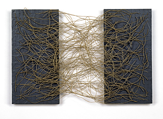
In last Friday's New York Times, Holland Cotter reviewed the Drawing Center's new show of work by the German expatriate artist Gego (nee Gertrude Goldschmidt). Born in 1912 and trained in architecture and engineering, she moved to Venezuela in 1939 to escape the Nazis (she was Jewish). In the early fifties, she developed her signature approach: dense abstract patterns of (mostly monochrome) lineson paper and in hanging wire structures. These patterns range from careful stripes and tight geometric patterns to the wild tangles characteristic of her later years. She died in 1994.

“Gego, Between Transparency and the Invisible” was curated by Mari Carmen Ramirez for the Houston Museum of Fine Arts, where it was originally shown. According to the press release, the show emphasizes:
the critical role that drawing played in the artist's oeuvre. On view
will be nearly 60 artworks which include ink drawings,
three-dimensional structures, watercolors, artist books,
and tejeduras
(The tejeduras are woven from strips of found printed paper.)

My first
and so far my onlyin the flesh encounter with her work took place at Harvard's Fogg Museum about six years ago. She had a few of her wire pieces in the show "Geometric Abstraction: Latin American Art from the Patricia Phelps de Cisneros Collection". I have only the faintest memory of them now, but I recall they intrigued me at the time. So I ought to get down to NYC before the show closes (on July 21) and reacquaint myself.

The review does a decent job of describing the work and hinting at its appeal. Of particular interest is the artist's refusal to see her three-dimensional work as sculpture. Cotter quotes this snippet from the artist's notebook: “Sculpture: three-dimensional forms of solid material. NEVER what I do!”. Although this reflects my own idiosyncracies, I'll say that I largely prefer the kind of thing she did. Her "drawing without paper" is reminiscent of work by different artists: Eva Hesse, Alan Saret, Sarah Sze, Sheila Pepe and Larry Kagan among others. Such work interacts with its settings in an exciting way and sets the eye to wandering about. Shadows can become an integral part of the work.

Labels: ,

Wednesday, April 04, 2007

times two

No, not new reviews of mine (I have one for next week), but two pieces of interest nevertheless. Wylie Schwartz reviews a new show by sculptor Ursula von Rydingsvard at the Johnson. Nice to have the company. Ursula will be speaking at the museum this afternoon at 5:15 and again tomorrow at 4:30. Also, good news, the Times has been awarded first place for its "Coverage of the Arts" by New York Press Association. Read more about it here.

Labels: ,

Wednesday, March 07, 2007

rhythm & blues

In the latest Times:
Nearly all the figures in "Blue Like Me"—a show of figurative paintings at Ithaca College's Handwerker Gallery—have a cyan tint. Although blue skin is traditionally an attribute of the Hindu god Krishna, not all of the figures here are obviously holy. Many are dressed in contemporary clothing or employ modern day props. These images can thus be seen as an attempt to democratize spirituality. The artist is Siona Benjamin and the pieces in the show are all from her "Finding Home" series, a meditation on cultural blending and dislocation. (All of these are titled Finding Home, followed by a number and a subtitle.)
More.

Related Links: Siona Benjamin, Handwerker Gallery, Benjamin at Cheryl Pelavin Fine Arts, Finding Home #49 (Venus).

Labels: , ,

Friday, March 02, 2007

hairy gu

So, last night I attended a Johnson museum lecture by star Chinese artist Wenda Gu (useful website with much photo documentation). The talk accompanies a current show of his work there. I'm planning to attend an afternoon symposium dedicated to the artist on Saturday (open to the public as these things generally are), so I'll keep things short and simple here.

Gu showed digital projections documenting his work while fielding questions from the audience. The focus was on his internationally themed United Nations installation series, along with a handful of early ink on paper pieces (featuring landscape and/or calligraphy) and some new "land art" projects. Curiously, he largely avoided mention of his Forest of Stone Steles series, a labor intensive project represented here in Ithaca by twelve elaborately carved stones, each with accompanying ink on paper rubbings. (You can see my not entirely favorable review—which I still stand by—here.) But he did conclude the evening by showing a video depicting some of the work behind the piece. His steles were quarried and carved, largely by hand, by traditional Chinese craftspeople.

Gu's presentation of the United Nations series was similarly (and welcomely) focused on material and technique, along with some of the more straightforward responses generated in his audiences. The installations are notable for being made primarily out of human hair (held together with glue and other materials). He discussed at some length how this made some people uncomfortable, both for general reasons and culturally specific ones—for example a version in Israel inviting the threat of government censure because of Holocaust associations. He talked about the collection process: from his early days going from "barbershop to barbershop" to his current method of getting museums or other organizations to collect local locks. He explained how his use of hair from different racial groups (along with "gay hair"!) was intended to symbolize both diversity and unity. I'm not quite sure that I quite buy this last claim.

Gu also covered the subject of his simplified or invented "Chinese" characters, a trademark of his (and of a number of contemporary Chinese artists, for some reason). Not being able to read Chinese characters, I am probably unqualified to fully evaluate this central aspect of his work. But I suppose Gu would respond that miscommunication (or lack of communication even) is his real central theme, in which case I may be perfectly qualified.
I'll have more on this topic and others after attending the Saturday event and having it all explained to me.

Labels: ,

Wednesday, February 07, 2007

wenda gu

From this week's Times:
Born in 1955 in Shanghai, Wenda Gu is today one of China's leading artists on the international contemporary art scene. He works (and supervises the work of others) in both Brooklyn and his native land. His art - which often involves the manipulation of language - aims to be literary and philosophical as well as visual. Currently up at the Johnson are two of his installations: Forest of Stone Steles: Retranslation and Rewriting of Tang Poetry and United Nations: We Are Fortunate Animals. Both are samplings from larger projects which have been displayed in different configurations.
More.

Note that I'm not responsible for "stony irony".

Related Links: wendagu.com, "Between Shanghai and Manhattan", installation pictures, opening pictures.

Labels: , ,

Tuesday, November 07, 2006

travel diary: part one


David Byrne, Doggie Chew Toy, 2006


Robert Rauschenberg, Baby Venice (Scenarios), 2005


As I've been saying all along, I spent most of last week on the road, and in Buffalo, New York, and Boston. Here is a record of what I did, written afterwards as an aid to my slippery memory. I'll be putting this up in installments, perhaps two or three.

I made a day trip to Buffalo on Sunday, accompanied by my old man and two old family friends. The weather was sunny and fairly warm, but you could see felled trees and other signs from an earlier snowstorm. After eating some excellent Buffalo wings (and some other food, which was not so hot) at the legendary Anchor Bar, we headed straight to the Albright-Knox Gallery.

There I saw the stylish and fascinating, if indifferently installed and perhaps conceptually confused (and certainly confusing, for the uninitiated) Andrea Zittel survey Critic
al Space. Zittel constructs little architectural vignettes, with a focus on interior spaces. These combine playful imagination with a generally not too heavy-handed social critique. Several small gouaches got me thinking about how I often use the familiar medium of paintings as a vehicle for understanding the big scary world of conceptual art.

Needless to say, I also got to see some amazing work from their permanent collection. The main emphasis is on American postwar modernism (through perhaps 1970 or so). My favorite piece was Arshile Gorky's The Liver is the Cock's Comb, which as another gallery visitor pointed out, has something of a Disneyesque feel. For those completely unfamiliar with it: the combination of calligraphic black lines dissolving (into) animated color forms is incredible. Classic paintings by Jasper Johns, Larry Poons, Jackson Pollock and Richard Diebenkorn were among the other highlights. I also liked Random Fire, by a younger (but unfortunately deceased) artist, Moira Dryer. A wooden panel covered with thin green streaks and punctured by holes, was accompanied by a music stand, on which sat a green target covered panel. It was a playful response to some of the high-Modernist masterpieces that surrounded it.


After a three or so hour drive back, I spent the rest of the evening and a quiet Monday, in Ithaca. On Tuesday morning, I woke up a little earlier than usual to catch a 1:35 a.m ShortLine bus from Collegetown in Ithaca to New York City. Contrary to the schedule posted on the Internet, however, there was in fact no bus leaving at the time. Around 2:00, I learned--from a bus driver arriving in Ithaca from NYC-- that my bus in fact had passed through an hour earlier. He told me that the same thing had happened the night before; for some reason he had neglected to notify anybody. I did get him to place a call, but his speech on the phone (it might have been a radio, actually) and to me and a fellow disgruntled traveller was soft and indecipherable. (This misinformation--assuming that that is in fact what it is--is still posted on their website as of this writing.) Anyway, after much drowsy pacing around, and a tasty if wholly inauthentic Greek meal in an all-night diner downtown (virtually impossible to find in Boston, last time I checked), I managed to catch the 4:15 bus and fell quickly asleep.

Arriving at the Port Authority dungeon at around 10 in the morning, I was not as bleary-eyed as I had feared. After eating the soggy remains of my diner cuisine, washed down with mouth-scalding coffee, I got my bearings (well, sort of) and walked out in search of art. I ended up, shortly afternoon, in a 57th Street gallery building, home to Pace/MacGill and PaceWildenstein. At the former was a series of cleverly re-imagined chairs by artist-musician David Byrne. These were built from unusual materials and took unusual forms. My favorite was a midget scaled love-seat, built out of molecular models. Also present were a number of related drawings and sketches, most interestingly a series embroidered on bits of upholstery (these being reminiscent of some of the work of Sigmar Polke). The oddball materialism of Tom Friedman is another point of reference for this show.

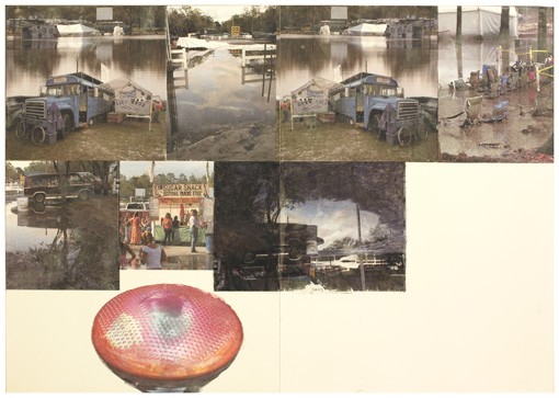
At the Wild P(l)ace, was a series of stacked shows, most prominently Robert Rauschenberg: Scenarios and the Ancient Incident. A series of nine recent "paintings"--actually done through some kind of photo-transfer process-each juxtapose a series of snapshot-like photos in a deceptively casual-looking manner. Each piece in the series depicts an iconic American scene; these range from the grittily urban to the quaintly rural. Climbing a rickety spiral straircase, I made it to their second space. While a series of Robert Mangold prints seemed to be the central attraction, I was more compelled by a small side room showing of Post-Impressionist and Picasso prints, published by the great Ambrose Vollard. The pieces in the room tie into a show at the Met, which I missed this time around. My favorites were two interior scenes from a well-known series by Edouard Vuillard (here and here). The colors, the flattened but still dynamic perspective, and the psychological dynamic of the two figures in III are exquisite. The galleries were being toured by a group of elderly Jewish ladies.

On 41st Street, I saw one of my anticipated highlights, Personal Geographies: Contemporary Artists Make Maps. The gallery is part of Hunter College. The school building, situated across the street from a large dirt lot under construction, looked bleak and unpromising from the outside. Inside were security guards, a metal detector, and line of students. Since the gallery-sitter--who was supposed to show up at 1:00--was missing in action, somebody else let me in and I had the gallery to myself for a while. It was made up of several cavernous spaces, forming something of a maze (appropriately, a color-coded map was included in the catalog). The cartographically themed work in the show went from the schematic and conceptual to the richly painterly. Although I am willing to embrace both extremes, my eye tends to be drawn to the latter more easily. This was especially true Tuesday, due to a lack of time (I'd like to go back to look at the stuff I only glanced at, but I fear this will not happen).

The best works in this vein were Joshua Dorman's paintings on old maps, affixed to panels. A long-time favorite of mine, Dorman alters these relics in ways that both echo and deviate wildly from the originals. Among the myriad modificaions and additions were painterly re-interpretations of rivers, roads, and other passageways, imaginary buildings and cities, (sometimes exotic) flora and fauna, and the assorted detritus of industrial and consumer society. He tries to use almost every kind of perspective in the book, sometimes all at once. One large, multi-paneled piece was ornate, even by Dorman's standards. One imagines that he felt there was too much there, because the piece features a large, empty white triange clearly obscuring yet more of his frenzied imaginings. Tiny Lives, Beantown, a take-off on Boston suburbia, was refreshingly straightforward. Here, he limited his intervention to delicately painted fields of pink, black, and light brown.

Another favorite of mine was a wall relief installation by Janice Caswell: a dense network, mapped with colored paper squares and dots, an eclectic assortment of push pins, and a dense web of thread and wire. Several colorful yet schematic drawings accompanied it. Also of particular interest were paintings and sculptures by Jennifer Dalton, Joyce Kozloff, Ward Shelley, and Danielle Tegeder.

A few artists presented works either not to my taste, or seemingly out of place in the show. Kim Jones' pencil maps of imagined battlefields, while interesting, seemed overly juvenile (without the skill or irony found in the conceptually related work of Kozloff). Abbey Leigh's freakish animal-vegetable hybrid drawings were appealing, but stretched the mapping idea a bit too far. "Body Maps", by the Bambanani Women's Group of South Africa were too rough and "primitive" in style and concept for my taste.

After leaving the gallery and once again getting my bearings, I hopped on a subway headed downtown, emerging a bit later in Chinatown. I found the kiosk and purchased $15 tickets for the Fung Wah bus to Boston. (Fung Wah is one of several companies providing inexpensive Chinatown to Chinatown travel. The buses are used mostly by Chinese Americans, but are also frequented by college students, hipsters, and other unsavory types.) Walking around the block, I found a fast food Chinese noodle soup place, where I got a decent made to order meal with meat and vegetables for three dollars. Being cheap paid off pretty well last week, I would say. The bus departed on-time at 4:00 p.m., and it got to Boston without anything going wrong, which is much more than I can say about ShortLine (more on them later).

Labels: , , ,

Wednesday, October 11, 2006

review

From today's Ithaca Times:
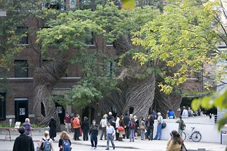
In Collegetown, nestled in between Cornell's Schwartz Center for the Performing Arts and Sheldon Court (a grad student dorm), North Carolina sculptor Patrick Dougherty has realized Half a Dozen of the Other, one of his signature tree branch installations. Six woven twisting towers form a V-shape, pointing away from the street. Each is supported by a living tree. The trees poke in and out, acting as rigid counterparts to the towers' fluid dance-like movement. From some angles the sculptures appear as domes, from others like frayed rope.
More here. Pictures.

Labels: ,

Tuesday, May 23, 2006

Mixed Nuts

The following paragraphs don't relate to each other too well. Many apologies.

I don't normally like to discuss my personal life here, except to the extent that it enters into the world of art. Likewise, I realize that it's painfully cliche to apologize for not updating your blog more often. I'd hate to do that. But I do want to say that I've been suffering from chronic insomnia, which makes it difficult to to write, think, experience art or to do much of anything else. If anybody has any unworkable folk remedies, by all means let me know. The more colorful (and ridculous), the better.

On a slightly less self indulgent note, if I'm not feeling too lousy, I'd like to follow-through on my long simmering plans to visit Boston later to this week. Among other things, I'd like to see (and write about) some art. Things that seem of particular interest include the Decordova Annual and Linda Price-Sneddon's "The Trees Have No Tongues", currently up at the Hallspace gallery. I like Linda's kind of work and don't get to see any around here. Wandering around the MFA would be nice, for old times sake. Saturday, Mobius is organizing a day of performance art and other oddities in front of city hall. Finally, Eva Hesse in NYC, if I can make it there. She's neat. If anybody has any tips, let me know.

I spent a few hours this afternoon at the Johnson, most of them with Willie Cole's travelling "Afterburn", which features work made in the past decade. (The title is a joking reference to his signature motif, the iron.) You might have read about it in the last Art in America. I took notes and will write substantially about it, although probably not in the next few days. I'll give you some idea of what I'm thinking. I want to discuss the work throught the filter of two concepts: primitivism and pastiche. I touched on the former in my last post, conveying my dissatisfaction with work which (naively, I think), attempts to recreate an idealized "primitive" condition within the modern world. Cole's work escapes this trap. My working hypothesis is that it does so by being contemporary (in its references and materials) while maintaining an anthropomorphic, animistic quality which links it to the past. As for the latter, it is difficult to write about his work without citing his numerous quotations from modern and contemporary art. And while recognzing these is part of the pleasure of his work, its important to go beyond simple name-dropping. Anyway, all of this is less tediously academic than it sounds, so of course I'll discuss individual pieces. The show is a lot of fun!

Labels: , ,

Saturday, April 22, 2006

Live Art

Cornell is hosting a number of horticultural art events, so let me mention those, if only to remind myself to attend and write about them (at least the ones I can get to). Enviromental artist Paul Cooper will be giving two seminars. One will be this coming Monday, from 11:15 (am) to 12:05 in Cornell's Plant Science building, Room 404. He will be speaking the following day at the Johnson, from 12:20 to 1:15. From the promotional material:
Artist and garden designer Paul Cooper has gained an international reputation for his innovative and often radical approach. His highly acclaimed and sometimes controversial portfolio includes private and commercial garden designs, show gardens, sculpture and environmental art. He is the author of four books: Gardens Without Boundaries, Interiorscapes, Living Sculpture and The New Tech Garden.
Also, at the Mann Library, you can see the self-explanatory "Art in Horticulture: Exhibit of Work from Hort 201".

On a related note, the Science Cabaret will be holding a art-science-entertainment event entitled "A Curiosity Cabinet of Fantastical Fungal Freaks" next Tuesday. Speakers will be mycologist Kathie Hodge, photographer Kent Loeffler and artist Tim Merrick. This takes place in downtown Ithaca's Lost Dog Cafe, starting at 7pm.

Yes, this is promotion (albeit selective promotion); I'll tell you what I I think about all of this later. Also, anybody interested in avant-garde landscape architecture should check out the blog Pruned. Enjoy.

Labels:

Thursday, March 23, 2006

Rauschenberg Combines

Well, I know I said that I was going to write about Rauschenberg's Combines, which I saw about a month ago at the Met . I wasn't going to keep that promise; who am I to add to the mountain of words already written about him? I'm still reluctant to write a full review or analysis of the show. However, I do want to respond to Tyler Green, who has a post about the show up today.

Green claims (with reference to Duchamp) that the Combines are not "retinal", that "the eye isn't seduced by them, the way it is by say, Monet." Frankly, this makes very little sense to me. On the contrary, the most salient feature about these pieces is their perceptual richness, their ability to draw the eye. The layering of image, texture, objects, and paint is staggering. Walking through the Met show, I kept feeling dizzy, like I was going to plummet into the the work (arguably, the experience does go beyond the strictly visual, into the tactile and the kinesthetic). The pieces stand in marked contrast to Jasper Johns' paintings of the same period, which hold you off, despite their richness of texture. (Perhaps it isn't an accident that Green chose the Johns-like Coca-Cola Plan as an illustration.) Sure, they require time and effort to fully appreciate, but so does Monet.

Jerry Saltz writes of Rauschenberg that he "is unafraid to have to have his work look cruddy". I doubt very much however, that Saltz actually thinks that any of the combines (or at least any of the successful ones) actually look cruddy. I certainly don't. I think Saltz simply has in mind an (apparent) sense of recklessness or improvisation. Sure, to a sensibilty weaned on Impressionism, the Combines are going to look ugly and awkward. But then again, when Monet's work was new, many (probably most) people thought it was ugly too. I'm probably over-reading Tyler's post, but I don't think he has a good basis for opposing Monet to Rauschenberg.

Tyler also discusses the quasi-religious character of the Combines, as installed at the Met. I think that this point potentially contradicts that of their supposedly anti-retinal nature. It is doubtful that an analogy to devotional images would work if the work itself wasn't so eye-catching. (This isn't to say that the institutional context is irrelevant.)

Labels: , , ,