Main Street Gallery Opening
Tonight, I attended the opening reception for The Main Street Gallery's annual "Spring Group Exhibition". The directors, husband and wife team Roger and Adrienne Bea Smith, deserve much credit for establishing a gallery in tiny Groton NY and putting on such consistantly high quality shows. This one, up through the 23rd of April, is both diverse and strong. The lack of bad work is conspicuous.
In lieu of a full review (and I do plan to go back in the coming weeks), I want to highlight the work of my two favorite artists from the show: Tracy Helgeson and Buzz Spector. (Yes, I knew these people somewhat before the opening, so maybe there is a bias here; make of that what you will.)
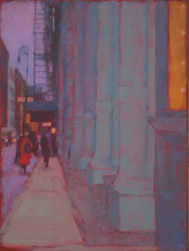
Helgesonwho has an lively and infomative blog about her artwork and life as a rural upstate New York paintershowed two small SoHo (NYC) cityscapes. The two pieces, Green Columns (12" by 16") and City Street at Dusk (12" by 9") are an interesting departure from the country landscapes she showed at the Main Street last fall. Perhaps I just miss living in the big city, but let me sketch out a formalist explanation of why I like these. The use of linear perspective and the way the architecture "fits" the rectangular edge of the panels, is quite a shift from work like this one. I'm probably not entitled to complain about amorphousness in painting myself, but many of these pieces seem too hazy, too otherworldly. Her city paintings also have a greater variety of detail than the often vaguely defined color fields of her other work, where the main details are often (no more than) brushstrokes. Her colors, as always, are lovely.
On a different note (and to flaunt the diversity of my taste), I also liked the two pieces by Spector, which were (on) handmade paper, embroidered with string cursive lettering. These pieces were also small, similar in size to Helgeson's. On the right, on gray paper (actually, a transluscent white layer over a black or dark gray), the spelled out title "the irony". On the left, on white (over black), "as if". "The" and "as" are torn out of the top layer of the paper, while "irony" (in blue) and "if" (in red) are written in string. I like the slightly awkward penmenship, the different textures, and the playful subversion of our attempts to find symbolism in color (why is irony blue?).
I spoke briefly with Spector, who chairs the art department at Cornell. At one point, I questioned him about his often cited status as a "conceptual" artist (for example, in the promotional material for this show). He responded that this was largely something that other people said about him and that this particular work was probably too textural and materially oriented for that classification anyway. We both agreed that this term was unfair to suposedly non-conceptual artists nonetheless interested in shooting for more than visual pleasure. (Don't get me wrong, I value visual pleasure a lot and I think Spector does too.)
I took some pictures of the openingincluding installation shots and close-ups of Spector's workbut I can't seem to load them at the moment. I'll put them up tommorow morning.
In lieu of a full review (and I do plan to go back in the coming weeks), I want to highlight the work of my two favorite artists from the show: Tracy Helgeson and Buzz Spector. (Yes, I knew these people somewhat before the opening, so maybe there is a bias here; make of that what you will.)
Helgesonwho has an lively and infomative blog about her artwork and life as a rural upstate New York paintershowed two small SoHo (NYC) cityscapes. The two pieces, Green Columns (12" by 16") and City Street at Dusk (12" by 9") are an interesting departure from the country landscapes she showed at the Main Street last fall. Perhaps I just miss living in the big city, but let me sketch out a formalist explanation of why I like these. The use of linear perspective and the way the architecture "fits" the rectangular edge of the panels, is quite a shift from work like this one. I'm probably not entitled to complain about amorphousness in painting myself, but many of these pieces seem too hazy, too otherworldly. Her city paintings also have a greater variety of detail than the often vaguely defined color fields of her other work, where the main details are often (no more than) brushstrokes. Her colors, as always, are lovely.
On a different note (and to flaunt the diversity of my taste), I also liked the two pieces by Spector, which were (on) handmade paper, embroidered with string cursive lettering. These pieces were also small, similar in size to Helgeson's. On the right, on gray paper (actually, a transluscent white layer over a black or dark gray), the spelled out title "the irony". On the left, on white (over black), "as if". "The" and "as" are torn out of the top layer of the paper, while "irony" (in blue) and "if" (in red) are written in string. I like the slightly awkward penmenship, the different textures, and the playful subversion of our attempts to find symbolism in color (why is irony blue?).
I spoke briefly with Spector, who chairs the art department at Cornell. At one point, I questioned him about his often cited status as a "conceptual" artist (for example, in the promotional material for this show). He responded that this was largely something that other people said about him and that this particular work was probably too textural and materially oriented for that classification anyway. We both agreed that this term was unfair to suposedly non-conceptual artists nonetheless interested in shooting for more than visual pleasure. (Don't get me wrong, I value visual pleasure a lot and I think Spector does too.)
I took some pictures of the openingincluding installation shots and close-ups of Spector's workbut I can't seem to load them at the moment. I'll put them up tommorow morning.
Labels: buzz spector, tracy helgeson
posted by arthur at 10:21 PM
![]()

1 Comments:
Hi Arthur, thanks for including a discussion of my work in your post about the show. I think your comments and observations about the show as well as my work are good. Glad to get a rating as a favorite artist too!
Post a Comment
<< Home