Saturday, December 23, 2006

reading and looking


Saul Steinberg, View of the World From 9th Avenue, 1976

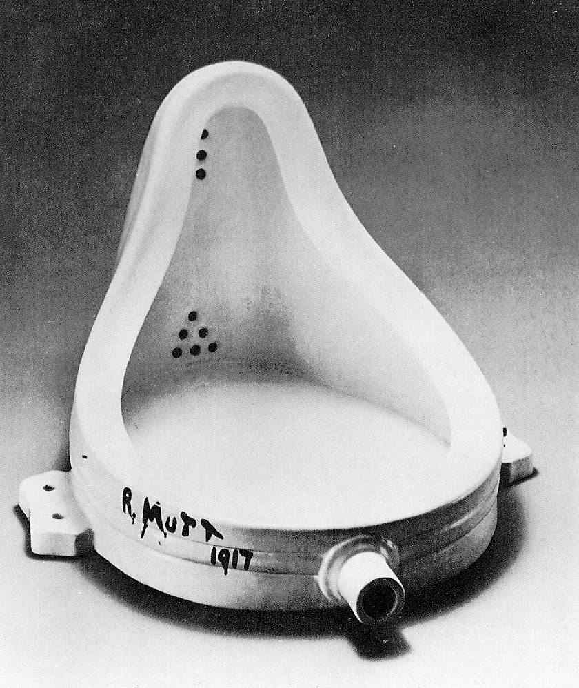
*Jerry Saltz on the current Brice Marden retro at MoMA.

*Tully Rector interviews Arthur Danto "On Art and Philosophy" in the latest Naked Punch. In addition to rehashing some themes from After the End of Art, he discusses some of his philosophical influences and has some provocative things to say about (relatively) young artists.

*Mark Stevens reviews the current Saul Steinberg shows at the Morgan Library and Museum and the Museum of the City of New York. Also see this smart little essay, once again by Danto.

*Ithaca's major cultural event of January is probably the annual Light in Winter Festival, running during the final weekend of the month. According to festival director (and local painter) Barbara Mink:
Our 2007 festival features "connections" between us and the world we live in: music and art, engineering and sound, the smallest components of matter and the visible world, physics and movement, our actions and their effect on our planet, the brain and the senses, and animal whispers and film sound.
The website features the program for this years festival, as well as an archive of material from past years. There is also the by now obligatory blog, which is worth a quick look. It looks to be an exciting event; no doubt I'll have more to say.

*Aaron Arm at the Ithacan covers sculptor Itty Neuhaus' recent local exhibition, "Common Ground".

*Art and Perception, a group blog to which I've contributed posts and where I comment frequently. Many of the writers there are smarter and/or more interesting than I've been recently here. Although the thought of another art blog to read is probably more than most can bear, A&P is well worth checking out.

Labels: , ,

Wednesday, December 13, 2006

irony and sincerity

Recently, I attended a local lecture by the New York City painter Alexis Rockman. Although his lecture touched on a number of subjects, one he kept returning to was that of the artist's emotional commitment to her work. He started the lecture by giving a somewhat rote presentation of the historical development of his own paintings. This development was fed by myriad cultural influences, resulting in what appear to be richly allusive and iconographicaly dense landscapes. (I'll admit to being only superficially familiar with the actual work, which isn't my main subject here). Artistic influences that Rockman cited include Thomas Cole's well-known Course of Empire series, the dinosaur artist Charles R. Knight, Goya's war etchings, Diego Rivera's murals, and The Planet of the Apes. In addition, the artist has been interested in the natural sciences, in particular evolutionary biology, geology and climatology. The intersection of nature with both science and art has been a central concern. As you can imagine, taking on all of this withing the landscape painting genre has required both erudition and considerable forethought in terms of draftsmanship and painterly execution.

In an exhibition last April however, Rockman showed--along with his usual oils on wood panels--a series of five oil on paper paintings. While treating analogous themes of disaster and apocalypse, they appear to be much rougher and more painterly in their execution. (I didn't see the show, so I'm relying on the gallery website, as well as the artist's own descriptions.) Significantly, they show destruction directly, while the panel pieces depict its aftermath. The importance of this new direction dominated the second half or so of the lecture. He stressed that this greater physical involvement with his working material went along with, and was intended to signal a more spontaneous, playful and emotional approach, one less detached and intellectual. He also described this as a return to his long-buried roots in Surrealism and Abstract Expressionism.

This change of direction and the personal and cultural conflicts it reveals and addresses are of interest to me, both as a (lapsed) artist and as a fan and critic of other people's art. I come from an intellectual background, and while my relationship to formal schooling has been hit or miss, I do value "book-learning" as a way of understanding both visual art and the culture more broadly. I believe that its important to be aware of art's history and philosophies and the ways in which these relate to other things. Most of the works of art that I value the most have more than strictly visual or expressive value, they connect to ideas and to history. Not everybody shares my values of course, but they do have wide currency in the contemporary artworld (in fashionable art galleries and magazines, for example). Alexis Rockman is as much a symptom of this as I am. For example, he stressed the need for the contemporary artist to "position" himself and his artistic approach, an injunction seemingly in contrast to his praise of emotional authenticity. The result of all of this is that work not sharing in these values often comes off as being naive, or provincial. No matter how well-done or beautiful, it can seem besides the point.

However, this kind of cultural and philosophical awareness can be dangerous, as anybody who has spent time browsing fashionable big city galleries hopefully recognizes. As I've been saying, an artist should be aware of his cultural environment and its history. Being a naif is usually a recipie for boring, cliched art (there are exceptions). But to merely reflect the culture in a passive, unreflective way tends to result in something distinct but similar. And to respond to it in an solely academic way usually results in "innovations" that are tedious and ultimately predictable. What Alexis was trying to get at, and what I'm trying to get at is that there needs to be a genuine personal commitment and that this needs to be evident somehow in the work. His solution has been to return to the materiality of paint; no doubt many other approaches exist.

In terms of radical formal and conceptual innovations, it appears that art has gone about as far as it can go, at least for the time being. The twentieth century was a period dominated by such innovations, done under the myth of moving art forward, of making progress. This effort (and its sustaining narrative) have largely collapsed, but some artists appear to be in denial. Tying your individuality or your ego to radicalism for radicalism's sake doesn't work any more, at least not for most young people. A lot of things don't work anymore (or they never worked in the first place).

What does work, although of course not always, is a tricky balancing act. Irony, intellect, and detachment need to be somehow reconciled with sincerity, passion and love of life and art. On one hand, we have the image of the cool, calculating conceptual artist, a figure who doesn't like to touch things (literally and/or metaphorically). On the other, we have that of the wild expressionist artist, driven solely by is instincts and feelings, largely oblivious to the world around him. These are crude stereotypes of course, but they help give shape to our picture of the field. There are also plenty of artists to which they are more or less applicable. Neither of these seems to work anymore. At any rate, they don't work for me, and they don't seem to be working for the majority of artists I respect most. (Which artists are these? Look around my blog and find out.)

Also posted at Art and Perception.

Labels:

Friday, December 01, 2006

out of line reviewed

Drawings and "works on paper" are popular these days, not simply as a medium, but also as an artistic, and perhaps more significantly, a curatorial theme. For example, in the winter of 2002 and 2003, the Museum of Modern Art (then out in Queens) put on Drawing Now: Eight Propositions. Organized by Laura Hoptman, that show attempted to bring some provisional order to bear on the diversity of contemporary drawing. The work there was uneven, often featuring lesser work by well-known artists. More significantly, for my purposes here, the eight categories imposed--the "propositions"--felt arbitrary and sometimes interchangeable. A sort of follow-up, Transforming Chronologies appeared at the new MoMA in two installments earlier this year. Curated by Luis Perez-Oramas, the show featured work of the past 140 years, but was also arranged thematically rather than chronologically. The themes were based more on visual analogy than the relatively traditional genre classifications of the earlier show. That (and no doubt the broader available selection of works) made for a much stronger show.

Out of Line: Drawings from the Collection of Sherry and Joel Mallin, currently up at the Herbert F. Johnson Museum, has elements in common with these and other contemporary drawing shows. Like the Queens show, it features work by living artists. Most of them were born in the 60's and 70's, but a good number are older, which makes for greater diversity. The show was curated by Nancy Green, and features works from an alumni collection. It may seem mean of me to compare the their efforts to those of the Modern (and this isn't the first time I've done so). But the show is clearly derivative, in broad conception, if not in the details of its execution. So some context is needed. Anyway, the show is a strong one, and stands up well against its better known predecessors. Notably, there are no formal categories, which works quite well. Nevertheless, the temptation to categorize is hard to resist.

Several works in the show employ collage or use paper in a sculptural manner. The most spectacular of these is Matt Bryans' wall engulfing untitled collage, made from newspaper cutouts and reaching perhaps twenty feet tall. The original text and imagery is gone, having been laborously smeared and erased. In their place, ghostly faces (often grinning) emerge out of a map-like field of light and dark. Jim Hodges' Flowering Big Pink, on the other hand, is small--the size of a notebook sheet--and delicate, girly. Its flower-head and leaf (or tear) shaped cutout holes and pop-up flower are colored decoratively in colored pencil, and (allegedly) chewing gum marks. Julia Rose Clarke's Pretty in Pink, which is made of text and cutout images hung from a series of dangling threads, takes cuteness into a more ornate direction. Kirsten Hassenfield sculptural Spyglass resembles a paper lampshade and is suspended from chains (also made from paper).

A series of five etched silver nets Rachel Whiteread also fit loosely into this category. While pinned in some places to a backing board using tiny clips, elsewhere they float above, casting shadows. These vary considerably in thickness , texture and directional orientation; they alternately resemble fishnets, old city blocks, flowers and honeycombs. Sometimes the nets are solid, other times fraying.

Many of the older artists in Out of Line work in more or less traditional modes of abstraction. Richard Serra's thick black oil-stick masses and Sean Scully's richly painted bricks (more effectively executed here in oil than in pastel) seem like almost perfunctory inclusions. Both less expected and more interesting are pieces by less canonical artists. Sculptor Ursula von Rydingsvard's loose charcoal and oil-stick drawing resembles a landscape seen through a chain link fence, while Leonardo Drew's oil features brushy highlights over a dark reddish brown ground. Sharon M. Louden's Merge does exactly that: white brushstrokes on white Mylar, pinned directly to the white wall.

The figure, both as portrait and in interaction with others or with the landscape, is another recurring theme. Graham Little's portrait of a fashionable young woman is done in colored pencil and gouache over gesso, giving her face and hands a rough but even texture. Combined with her mannerist pose, the effect is subtly estranging. In E.V. Day's simple, playful (pencil) line drawing, a lady appears headless until you notice it protruding from the umbrella she carries in one of her elongated arms. Peter Doig's Drifter wears a cowboy hat and strides forth precariously into a thinly painted greenish landscape, while Kojo Griffen's Untitled (Man Teaching a Boy to Shoot) shows the influence of comics and graphic design.

Penny Siopis' Shame Series, a set of nine paintings enclosed in a glass vitrine, depict grotesque scenes of sexual violence and racial conflict. One image shows a dark skinned head swallowing a white woman, her legs sticking out. These scenes are rendered (inappropriately?) delightful through their color palette (pinks, browns, purples and whites), the paints often glossy finish, and the use of ornate printed lettering, which suggests Valentine's Day cards.

Also interesting is Adam Dant's Broadgate, a large canvas pinned to the wall, with lines drawn in purple ink. The scene is a construction or excavation site, a mass of walls, barbed wire, construction vehicles, bridges, towers, and assorted detritus. Amidst the more geometric architectural forms is a veritable flood of wavy calligraphic lines, resembling water or fire. From these emerges the ghostly head of a ram, perhaps a spirit disturbed by all the activity. Policemen, construction workers and men in suits are scattered about, seemingly oblivious.

Animals and monsters make other appearances. The best of these by far is in a series of four mud on paper drawings by Alexis Rockman. Arranged in a square, these drawings depict simple, even iconic natural scenes: mating frogs, an anteater bending down for a meal, stacked tortoises (symbol of a bottomless, recursive universe), a big fish with smaller fish. The rough texture of the mud and the surprisingly subtle tonality are impressive. Rockman has called his mud drawings "earthworks on paper". Nigel Cook's oil on paper Snake and Owl combines a realistically rendered landscape of patchy grass and rocks with an improbably cartoonish owl. Other pieces, such as those by Nichola Tyson and Matthew Ritchie depict less natural looking beasts.

Jacco Olivier's token video animation shows an frog dancing maniacally and then hopping across a landscape. These scenes are interspersed with images of tree branches and abstract blurs and dots. The color is electric: blues and greens with shadows and blinding white highlights. The animation, which lasts a few minutes, is MTV fast.

A number of works in the show incorporate strategies associated with Minimalist and Conceptual art. Ewan Gibbs' Blooms Hotel is made up of a grid of circles, variable in thickness. While reminiscent of some of Eva Hesse's abstract drawings, the loops here coalesce into a recognizable scene, the corner of the banal looking hotel indicated by the title. Peggy Preheim creates yet another Duchamp homage, imprinting his infamous pissoir on a baseball resting inside a bell jar. Jenny Holzer has two tall columns of her signature aphorisms and short statements, here stenciled on paper. Arno appears to be an oblique biographical portrait.

Both Danica Phelps' June 20-26, 1999 and Jim Hodges' Talk to Me About Love combine bold color and (subtle) gesture with schematic representation. The top row of Phelps' piece tallies her expenses and income by the hour for a week. Each dollar is represented by a tiny brushstroke: reds and pinks on the minus side and greens on the plus side. Daily totals are on the bottom row. The middle maps out where Danica went.
Talk
is made up of two large panels, each containing a 5 by 4 grid of sheet music pages. Each sheet is a different love song, classic or contemporary. Covering the staff at variable intervals are irregularly cut strips of paper in various colors. Musical notation is usually thought to lack the emotional richness of performed music; Hodges' piece uses vivid color to subvert this idea.

The message of Out of Line is an optimistic one: a celebration of drawing's breadth and eclecticism. In this, it closely resembles the two MoMA shows I described above. While this might be old news to some (and this brief catalog essay does have wearily familiar and redundant sound to it), it is surely valuable to spread the word as widely as possible.

UPDATE (12/04): Republished in the latest Big Red & Shiny, check them out.

Labels: ,