Friday, March 31, 2006

Small Worlds

Carroll Dunham, Solar Eruption

Roxy Paine, Bad Planet


Terry Winters, Color and Information


Nina Bovasso, Winter Mound


Nina Bovasso, Treehouse

Robert and Shana ParkeHarrison, Consumption


Robert and Shana ParkeHarrison, Exhausted Globe


Gerry Bergstein, Climb #1

Pieter Bruegel, The Tower of Babel

I'll have more on the ParkeHarrisons coming soon. They will be speaking tomorrow at a Cornell symposium entitled "Shared Visions: Collaboration and Process in Contemporary Photography", which I'll be attending. You can find links to a live webcast of the event here.

Labels: ,

Thursday, March 30, 2006

Evett Retro

Tuesday evening, I attended the opening for a retrospective of works by the painter Kenneth Evett. The show is up at downtown Ithaca's Upstairs Gallery through April 22. Evett, who died recently at the age of 91 (I never knew him), taught at Cornell from 1948 to 1979. He is represented Upstairs by a small selection of oil paintings, watercolors and works on paper.

The show was frustrating because it was too small to really serve the function of a retrospective. Only his landscapes and the still-lifes
which took up most of the main gallery areawere adequately represented. Sketches, portraits and a female nude were relegated to the cramped back office. There wasn't enough room to manouever around to see them properly. My personal favorite, the Feininger-like ink on paper Seascape, was in the office too. A show that only represents two series of workpainted mostly in the last decades of a long careerisn't really a retrospective as far as I'm concerened. The basic problem is simply that the gallery is too small for something like this. (Although apparently Evett had another retrospective there in 1996, featuring over 100 works hung salon-style, which may very well have worked.) Anyway, it would have been a stronger show if it was more focused.

The work itself is quite good, if modestly so. It strongly recalls prewar American modernism, a tradition with which Evett was no doubt greatly familiar. I was variously reminded of such fine painters as Charles Demuth, John Marin, Milton Avery, and Ben Shahn. It isn't a big deal. It is a little strange, as if the last 60 years of art history hadn't happened. While I admire this historical awareness, it does detract somwhat from the enjoyment of the work to constantly be reminded of similar but better work by other artists.

I should say more about the actual work (which I liked), but that will have to another post. Do go see the show if you're in the area.

Labels: ,

Thursday, March 23, 2006

Rauschenberg Combines

Well, I know I said that I was going to write about Rauschenberg's Combines, which I saw about a month ago at the Met . I wasn't going to keep that promise; who am I to add to the mountain of words already written about him? I'm still reluctant to write a full review or analysis of the show. However, I do want to respond to Tyler Green, who has a post about the show up today.

Green claims (with reference to Duchamp) that the Combines are not "retinal", that "the eye isn't seduced by them, the way it is by say, Monet." Frankly, this makes very little sense to me. On the contrary, the most salient feature about these pieces is their perceptual richness, their ability to draw the eye. The layering of image, texture, objects, and paint is staggering. Walking through the Met show, I kept feeling dizzy, like I was going to plummet into the the work (arguably, the experience does go beyond the strictly visual, into the tactile and the kinesthetic). The pieces stand in marked contrast to Jasper Johns' paintings of the same period, which hold you off, despite their richness of texture. (Perhaps it isn't an accident that Green chose the Johns-like Coca-Cola Plan as an illustration.) Sure, they require time and effort to fully appreciate, but so does Monet.

Jerry Saltz writes of Rauschenberg that he "is unafraid to have to have his work look cruddy". I doubt very much however, that Saltz actually thinks that any of the combines (or at least any of the successful ones) actually look cruddy. I certainly don't. I think Saltz simply has in mind an (apparent) sense of recklessness or improvisation. Sure, to a sensibilty weaned on Impressionism, the Combines are going to look ugly and awkward. But then again, when Monet's work was new, many (probably most) people thought it was ugly too. I'm probably over-reading Tyler's post, but I don't think he has a good basis for opposing Monet to Rauschenberg.

Tyler also discusses the quasi-religious character of the Combines, as installed at the Met. I think that this point potentially contradicts that of their supposedly anti-retinal nature. It is doubtful that an analogy to devotional images would work if the work itself wasn't so eye-catching. (This isn't to say that the institutional context is irrelevant.)

Labels: , , ,

Tuesday, March 21, 2006

Self Indulgence

It has come to my attention that there are people out there reading this site, some of you spending a good deal of time here. I appreciate that. Nevertheless, I often feel like I'm talking to myself (although I don't think that there is anything necessarily wrong with that). As I am currently at something of an impasse, I would appreciate any kind of feedback regarding the possible future direction(s) of this site. What is it this draws you here? What is it that bores you or makes you want to run away? Do any of you agree or diagree with anything that I'm saying? I spent a great deal of effort picking out the links on the right sidebar; does anybody find (any of) them as interesting as I do? My goals for this blog are ambitious (if only moderately so); I would like to reach out beyond whatever narrow social circles I would move in, constrained by earthly geometry and my own sloth. So if I could get such responses without direct solicitation, I won't have to bore any of you with posts like this one in the future. Thanks again.

Labels:

Monday, March 20, 2006

Local Art Happenings and Links

Let me mention a menagerie of things going on around here, and some linked commentary on things past. I think I'm going to make this a regular (perhaps weekly) feature. If anybody wants to send me links or notices similar to these, I'll consider posting them here.

*I missed Ithaca's March 3rd Gallery Night, but Ezra of the blog Ithaca Sucks apparently didn't. He has a funny, intemperate rant about it (and the local art scene more generally) here. Needless to say, I don't endorse all he has to say, but his comments about the local waterfall painters and their "Yankee aesthetic" are right on. See also my own comments on landscape painting here.

*"Okinawa Soul", an exhibition of work by the Japanese documentary photographer Ishikawa Mao is on display at Cornell's Hartell Gallery through the end of this week (either Friday or Saturday, according to the source). Mao focuses on the life of her native prefacture of Okinawa, a chain of islands south of mainland Japan. In particular, she focuses on the impact of militarization
both American and Japaneseon the local culture. I thought the showwhich was co-curated by the Cornell grad students Kelly Dietz and Nakamori Yasufumiwas uneven, judged by the aesthetic standards of gallery art, but still interesting and informative. I am writing a longer piece about the show, which I'll try to post it here in the next few days.

*At the reception for the Mao show, I had the good fortune to meet fellow art-blogger Stacy Oborn, who writes and photographs the space in between. Unfortunately, it looks like her blog hasn't been updated since last November, but she tells me she does plan to update some time, so who knows.

*In other Cornell photography news, Robert and Shana ParkeHarrison will be lecturing at the Johnson on the 30th at 5:15 p.m. Their travelling show, "The Architect's Brother" opens there on the 25th and stays up until the 11th of June. It features elaborate constructed landscapes with mythic themes. Modern Kicks, who saw the show at the DeCordova museum in Massachusetts, has a piece about it here. The Johnson is also holding a related symposium entitled "Shared Visions: Collaboration and Process in Contemporary Photography" on the first of April. It is free and open to the public, but the registration deadline is this Friday. More information is available at the museum's calendar page.

*Nancy Geyer interviewed my favorite local printmaker Craig Mains for the Ithaca Times last October. See some of my own thoughts about Mains here.

*I met local painter-collagist Syau-Cheng Lai at the Main Street Gallery opening last Saturday (she wasn't in the show). While I hesitate to endorse work that I've seen only in reproduction, the intricate, archeological images on her website certainly make me want to seek out the originals (she tells me, however, that her new work is different). Luckily, her work can be seen in the current two person show "Optical/Lyrical", up at the Cedar Arts Center in Corning, NY. There will be an artists' talk on the last day of the show, April 1.

Labels:

Sunday, March 19, 2006

About Last Night

I still can't seem to post pictures to Blogger, but you can see an (unedited) set of pictures from the Main Street Gallery opening last night here.

Saturday, March 18, 2006

Main Street Gallery Opening

Tonight, I attended the opening reception for The Main Street Gallery's annual "Spring Group Exhibition". The directors, husband and wife team Roger and Adrienne Bea Smith, deserve much credit for establishing a gallery in tiny Groton NY and putting on such consistantly high quality shows. This one, up through the 23rd of April, is both diverse and strong. The lack of bad work is conspicuous.

In lieu of a full review (and I do plan to go back in the coming weeks), I want to highlight the work of my two favorite artists from the show: Tracy Helgeson and Buzz Spector. (Yes, I knew these people somewhat before the opening, so maybe there is a bias here; make of that what you will.)

Helgeson
—who has an lively and infomative blog about her artwork and life as a rural upstate New York painter—showed two small SoHo (NYC) cityscapes. The two pieces, Green Columns (12" by 16") and City Street at Dusk (12" by 9") are an interesting departure from the country landscapes she showed at the Main Street last fall. Perhaps I just miss living in the big city, but let me sketch out a formalist explanation of why I like these. The use of linear perspective and the way the architecture "fits" the rectangular edge of the panels, is quite a shift from work like this one. I'm probably not entitled to complain about amorphousness in painting myself, but many of these pieces seem too hazy, too otherworldly. Her city paintings also have a greater variety of detail than the often vaguely defined color fields of her other work, where the main details are often (no more than) brushstrokes. Her colors, as always, are lovely.

On a different note (and to flaunt the diversity of my taste), I also liked the two pieces by Spector, which were (on) handmade paper, embroidered with string cursiv
e lettering. These pieces were also small, similar in size to Helgeson's. On the right, on gray paper (actually, a transluscent white layer over a black or dark gray), the spelled out title "the irony". On the left, on white (over black), "as if". "The" and "as" are torn out of the top layer of the paper, while "irony" (in blue) and "if" (in red) are written in string. I like the slightly awkward penmenship, the different textures, and the playful subversion of our attempts to find symbolism in color (why is irony blue?).

I spoke briefly with Spector, who chairs the art department at Cornell. At one point, I questioned him about his often cited status as a "conceptual" artist (for example, in the promotional material for this show). He responded that this was largely something that other people said about him and that this particular work was probably too textural and materially oriented for that classification anyway. We both agreed that this term was unfair to suposedly non-conceptual artists nonetheless interested in shooting for more than visual pleasure. (Don't get me wrong, I value visual pleasure a lot and I think Spector does too.)

I took some pictures of the opening
—including installation shots and close-ups of Spector's work—but I can't seem to load them at the moment. I'll put them up tommorow morning.

Labels: ,

Friday, March 17, 2006

Artist's Statement

Here's an artist's statement (or perhaps a mere fragment of one) I wrote quite a while ago.
I create satellite's eye views of virtual landscapes. Accumulations of diverse and contradictory forms reference the complexity of modern day urban and suburban sprawl. Electronic, city-like grids conflict with painterly flooding and growth. Endlessly looping roads and passageways curve around and sometimes dead end into closed circular cells. Trees and buildings emerge from an abstract terrain and vines and wires connect disparate communities into a tenuous whole. Comic book speech balloons offer visions of new worlds yet to be constructed, questioning the distinction we make between our private visions and our shared experience of the physical world. These marks represent mazes and prisons, which can perhaps be altered or added to but from which escape is ultimately impossible. I intend to create a world in which this sense of confinement would be as interesting as possible.
More about my own art and other peoples' coming up, I promise.

Monday, March 13, 2006

Some Artwork of Mine


Let me post images of my some of my own work. These were in a group show at The Main Street Gallery in Groton, NY last Decemeber and early January. Their "Spring Group Exhibition" will open this Friday, with a reception on Saturday. (It looks like a pretty strong grouping, so consider the six hour drive from NYC, if you live there.) Explanations and more work will be forthcoming. Any comments would be greatly appreciated.

Tuesday, March 07, 2006

Siena Lecture

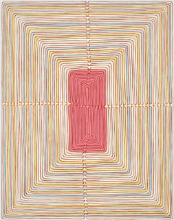
Tuesday, I got to see James Siena lecture at Cornell, which was a treat. The hall at the top of the Johnson's important I.M. Pei designed building (more here) was crowded with students and fans of his work. He showed many slides of his artwork (mostly paintings, some drawings and prints). These pieces are highly detailed and intricate, which was unfortunate for those not sitting in the front rows (as I was).

He showed and discussed the early development of his work, from his student days at Cornell (where he got a BFA the year I was born) through the late eighties or so. These earlier pieces, unlike the work for which Siena is known, were rough and thickly painted. Gradually, he abandoned this approach for a more craftsmanlike (as he emphasized) method characterized by carefullness and the use of premeditated rules to create structures.
After covering his early period, he switched from a
chronological approach to a taxonomic one, dividing his work into broad (and sometimes blurring) categories. Some of these (with examples) include: combs, nesting rectangles, crystal-like latttices, batteries (see above), doubling lines, radiating lines, non-slices, as well as more biomorphic pieces.

In response to my question about the continuity of his work, Siena responded that he has always tried to capture the "ontological intricacy" of the natural world, a intricacy he experienced (and drew) on summer trips to the Sierra Nevada mountains. Drawing off of this remark, I thought more about the relationship between two types of intricacy in art: that of Siena and like-minded artists—like Sol LeWitt and Tom Friedman for example—versus that of (say) Larry Poons, which Siena emulated earlier on. While the former can be seen as cognitive, structural and schematic the latter can come across as materialistic, physical and (perhaps) expressive. A map or representation as opposed to a real thing, an object. Although both may be ontologically intricate, the former are epistemologically so as well (if I may follow in his pseudo-philosophizing vein). Rather than simply provoking awe, they encourage you to try to understand the processes by which such intricacy can be generated. It is the difference between appreciating the complexity of nature and its materials and trying to reconstruct this complexity artificially. I wouldn't say that one way is intrinsically better than the other, but Siena did make a strong case for his own approach.

Siena also made negative comments about some of the ways critics try to describe his works. He disavowed the use of the terms "obsessive" and "compulsive" (as in obsessive-compulsive disorder). These words, he explained, are problematic because they pathologize artistic behavior. They also crop up fairly often as exhibition titles. He told a story of having lunch with the director of MoMA and being told that his work was on display there, in a show of prints called "The Compulsive Line" (which I saw myself a few weeks ago). Needless to say, he wasn't t
oo pleased. Here is another example: the show of "Obsessive Drawing", currently on display at The Museum of American Folk Art, practically right next to the Modern. I don't know, but I'll bet that these two are supposed to tie together. These terms bother me too, particularly since they are often applied to my own work—and by extension, to me. I'm not a psychologist, but I would like to think that what I do as an artist is healthy. Unfortunately, I've used these terms myself in artist's statements and the like; I should think twice before doing so again.

In response to a audience query, Siena also mocked the efforts of critics to link his work with various traditions of non-European art: Celtic, Indian, Aztec, Chinese, and so forth (as if these were interchangeable). He gave a plausible naturalistic explanation: love of pattern and detail is a universal human trait. That said, his work obviously does have traceable influences. He singled out one, his friend (and companion on scavenging trips to scrapyards), the sculptor Alan Saret, an interesting looking artist with whom I wasn't familiar.

Two more Siena links for those interested: a gallery page for his recent show at PaceWildenstein and a review of that show.

Labels: ,

Monday, March 06, 2006

Some Thoughts on Art Blogs

Tyler Green, of Modern Art Notes fame, has been kind enough to link to my site. As you might guess, this counts for a lot, since my site is new and obscure, and his well-established. (MAN is "the most infuential of all visual-arts blogs" according to this Wall Street Journal article.) As you can see, my number of visits went through the ceiling this afternoon. Thanks Tyler!

Green also wrote this little essay, in which he discusses the impact of blogging on the state of art criticism. Locally directed criticism, he argues, is fading away; "now every critic has a shot at a national audience". Surely, the latter
—if not the former—is true. He does point to one problem, that of trying to reach both a local audience and a broader one. He cites the case of Washington Post reviewer Blake Gopnik, who wrote a review of some shows in Chelsea (as I did myself a few posts ago). These were intended for a local audience, according to Green. The piece elicited this sarcastic response from the art blog From the Floor:
In what has to be the strangest lead-in to a multi-gallery review piece I have ever seen, Blake Gopnik announced to readers of The Washington Post last weekend that there is this neighborhood in New York called Chelsea. And that there are a lot of galleries that show art there. And some of the art is good. But some of it is bad, too.

Very interesting, Blake.

Of course, something like this could have been directed at my own Chelsea piece, which is a bit troublesome.

Green presents this as being simply a difference in sophistication, a split between the "arterati" and the typical Post reader (although presumably there is some overlap). In this particular instance, he might be on track. More generally however, I think that "sophistication" in the visual arts does have an significant local aspect. Judging by what most art bloggers (and other art writers) actually write about, physical proximity is central to the experience of most art. This seems to apply even to art that exists as multiples (prints, photography, video art, etc), which can be seen in different locations simultaneously. Green points out there are more book blogs than art blogs and that the former are much more influential. Although there are surely many reasons for this, I suspect that the major one is that anybody can obtain and read a book anywhere (usually inexpensively), which means that your particular locality is largely irrelevant to a discussion about literature. Clearly, this isn't the case with most visual art.

The result of all of this is that there is an asymmetry between the national (and even global) reach of art blogs and the local character of much of what they cover
—or should cover. This problem is of particular interest to me since I live in a small isolated town, but it applies to all art bloggers. If I cover locally displayed art, then my non-local readers will probably be unable to see the actual works that I am refering to. The same basic problem happens if I cover non-local art. Of course, both individual works and whole exhibitions do travel, and mechanical reproduction does make art more broadly accessible (a good thing). Still, the problem of the split audience isn't just one of uneveness in general education.

Labels:

Sunday, March 05, 2006

James Siena

James Siena, a fascinating artist (and a neat guy too), is lecturing at the Johnson this coming Tuesday. Check it out if you are in the Ithaca area. It starts at 5:15 in the evening. I'll post some of my own commentary afterwards, but here a few links of note: an old looking homepage (check out the links), an interview, and two exhibition reviews—here and here. Also, Edward Winkleman has an nice "artist of the week" feature on the artist.

Labels:

Wednesday, March 01, 2006

Some Thoughts on Landscape

As Nancy Geyer points out in this thoughtful comment, Ithaca is indeed "inundated with uninspired landscape paintings"; she also points to a similar problem with with landscape photography. Works—often not very well done—do look as if they "could have been painted centuries ago". Since I agree that this an issue (and not just here, I've seen similar work living in Boston), let me offer a few ideas, not all of them specific to the problem of landscape. Also, these may be slanted more towards painting and drawing (my own focus as an artist), than photography or other media. The point is to suggest alternatives to cliche.

*Artists should be aware of art history. This means both breadth and depth. They should look at what artists from a wide range of times and places have done, and have some sense of how it all interrelates. However, it is also important to look closer at things
—artists, styles, movements, techniques—that you find particularly interesting or useful. This is important for everyone, but perhaps particularly for those who see themselves as traditionalists. Being a traditionalist without (fully) understanding the tradition in question is a big problem, often leading to bodies of work that are confused and directionless (and boring).

*Artists should be familiar with a wide range of contemporary art. Obviously, this doesn't mean simply looking to jump on whatever the latest bandwagon is, nor does it mean uncritical approval. It does mean being aware of what your options are. It generally doesn't make much sense to just pick a date and say that nothing that developed after that is any good (unless you really know what you're talking about, which is rare). Travel, read, go to school
—do what you have to do.

*Look at the connection between landscape and abstraction. Many if not most of the early abstractionists (Mondrian, Kandinsky, Klee, O'Keefe, many others) developed this direction out of earlier work in landscape. You can see precursors of this approach in earlier landscape painting
—for example the work of J.M.W. Turner. Landscape can take us away from our usual sense of scale, away from the world of familiar people and objects. It can be macroscopic or microscopic. It can incorporate distortions, other ways of seeing and depicting. NYC artist Josh Dorman (more pictures here and here) does all of this ingeniously. Also worth paying attention to are locals Barbara Mink and (more interestingly) Barbara Page.

*Landscape doesn't have to be pastoral. Cataclysm and chaos are a big part of the natural world. Likewise, violence is central to our culture (and others as well). Local printmaker Craig Mains (see my last post) is a good example, as is (my former teacher) painter Gerry Bergstein (more information and pictures here and here), sculptor Heide Fasnacht, as well as (again) Turner.

*Landscape isn't just natural landscape. It should go without saying that we are constantly surrounded by man-made things, even in the countryside. The interweaving of the natural and the artificial (even to the point where these categories can become blurred) is a particularly interesting subject.

I'm not a art teacher, so I don't have any clear ideas about what should be done in this field. Although I do think traditional techniques and approaches should be taught, I don't think its a good idea to simply pretend that we're living in the nineteenth century.

Labels: , , , ,