ink shop: 03/21/08, afternoon


posted by arthur at 8:24 PM
3 comments

 Buzz Spector, Creeley's Creeleys, Internal Dye Diffusion Print (Polaroid), 36.75" x 24"
 Kumi Korf, Birds in Conversation, Gold, Intaglio Print on Japanese Paper, 36" x 20"
 Victoria Romanoff, The Oysters of Le Havre, Paper Mosaic
 Jeremiah Donovan, Walnut Bowl Inside/Out, Earthenware Clay layered with Terrasigilatta and Raku Glazes (Multi-Fired), 12" x 14"
The Main Street Gallery's annual spring show covers an eclectic range of styles and mediums with an emphasis on local artists. The show has been markedly strong in recent years (particularly relative to similar efforts by other area galleries) and this year's feels particularly so.
Cornell professor Buzz Spector's Creeley's Creeleys exemplifies his recent large format Polaroid work as well as his use of books as brick-like sculptural units. The bricks here come from the collection of the late poet Robert Creeley and collectively form an oblique, associative portrait. The volumes vary richly in color, design, and typography; some include author photos. They are arranged in a roughly circular cluster of small stacks (some clearly showing different editions of the same book). The stacks zig-zag — facing in different directions — and grow taller towards the back. They sit on rough, unpainted floorboards which emphasize the picture's deep perspective. (As does the contrasting flatness of scattered volumes placed upright, more or less parallel to the picture-plane, as if in a bookstore display) The image itself is sensuous with subtle contrasting tones and artful blurring along the top and bottom edges.
Birds in Conversation, Gold, by Ithacan Kumi Korf, is another standout. The tall intaglio print belongs to a recent series in which she attempts to provide an abstract analogue for the experience of flight. Like others, this one features a flock of flatly painted, hard-edged shapes arranged against a brushy, gestural background. In Gold there are three. Moving from top to bottom, left to right and then back left: a warm grayish-blue one most resembling a bird in profile (wings closed), a burnt orange amoeba, and a red one suggesting a kite or an arrow. These are tied together by curving green line suggesting a flight line or a thread. These stick sharply out of a ground of indian yellow, printed over silver onto a thin tan-colored Japanese paper sheet.
Korf's long-standing print collaborator is Ink Shop master-printer Christa Wolf. Wolf herself is well-represented here by the monotype landscape Alegretto. The piece loosely depicts a view of the landscape surrounding her upstate NY farmhouse. The piece is arranged in vertical tiers of wave-like, gestural marks barely hinting at perspective. The bottom half is dominated by a pair of dark purple-brown tree trunks, gnarly and with bare branches leaping out sideways. The brushing reveals the white of the paper. The colors -- mostly greens with small patches of reddish brown --are faintly iridescent.
Victoria Romanoff (another well-known Ithacan), offers an engaging collage-painting, The Oysters of Le Havre. The bits that make up this "paper mosaic" fit each other snugly without overlapping. Although the scene is fragmented and filled with abstract mark-making, it is recognizable as a landscape with a shoreline. A relatively empty horizontal bar towards the top is warm gray (apparently sprayed) and indicates sky. Marks elsewhere are predominantly whitish — pink and blue — and applied via thick and thin paint and with chalk or crayon. The whole vista is surrounded by a pink painted border, relatively dark, but tied to the rest through similar marks.
The inclusion of functional pottery is a distinguishing characteristic of the Main Street's group shows; included here are the decoratively glazed vessels of Anna Velkoff Freeman — two tall cups and a wide, shallow bowl. The white on dark blue designs are stylized depictions of dangerous microbes. The inclusion of the foodborne e coli (on the bowl and one of the cups) is a cheap joke but their sinuous tendrils do form interesting patterns.
Much more interesting sculpturally are three asymmetric goblet-like bowls by the Groton native Jeremiah Donovan. They are inspired by the forms — interior and exterior — of walnuts, and their jagged inner ridges and staggered, uneven rims limit their functionality. Colors are copper brown and greenish. The outside edges (along with parts of the inside) are rough, covered in scored lines and accreted dirt clumps.
The least satisfying mode of art on display here is a figural, narrative surrealist sculpture based on an assemblage aesthetic. By far the strongest work in this vain is Gail Hoffman's Messenger, a bird-headed figurine welded together from cast bronze fragments. Included are casts from real objects, e.g. a leaf wing and a doily covering its chest. In comparison, Claire Harootunian's Angel Mine and Lead On look rather slight. Both feature tiny, minimally altered dolls sitting atop benches: clay and painted wood, respectively.
"Spring Group Exhibition" will be of greatest interest to those already familiar with the works of the artists shown. The particular style of combining well-known area artists with select (and perennial) "outsiders" is idiosyncratic to the Main Street. Visitors from past years should feel an engaging tension between the expected and the new, as different aspects of artists' work are (often slowly!) revealed.
Labels: ceramics, collage, ithaca times, painting, printmaking, sculpture
posted by arthur at 7:02 PM
0 comments
Late in the evening of this past January 8th, an accidental fire started in the three-storey Handwork Building at 102 W. State Street. The second floor was home to Ithaca’s community printshop. And while the Ink Shop did not face the catastrophic flame damage of their upstairs neighbor, the Ithaca Academy of Dance, it was blanketed in soot and water. On show, but thankfully only minimally damaged, was their most expensive endeavour to date, a show of work from Lafayette College’s Experimental Printmaking Institute. However, the structural damage done to the building means that they will have to wait, probably until at least next year, before they can consider moving back in.
In the meantime, the Shop's newly rented — and possibly permanent — location is in the second floor of the Community School of Music and Arts building at 330 E. State St. The association of the two non-profits has potential, especially as both organizations show visual art and teach it to the public. This is their third home since the Ink Shop's founding in 1999.
The new gallery can be entered either from a side entrance or through a back door exiting the CSMA's first floor space. After twisting up a rough, concrete staircase, you find yourself in a long hallway, facing towards the front of the building. A door on the left leads to an architect's office. The door on the right leads to the new shop: two cramped rooms lined up straight, front and back, with a marble-lined washroom in the very back, off to the right. Each main room has three tall windows dominating their right-hand walls. The view looks out the CSMA parking lot, with The Commons in the background. Despite the pristine white walls and elegant cornices, the space has a grittier feel than the old one.
The front room contains, on the right, an impromptu office with tables and desks arranged in a square, chairs lining the inside. Flat-file cases are scattered about. An open closet space has been added up against the back left corner of the room; its low homasote walls don't reach the ceiling. The awkward combination of uses — work, office, and exhibition — is a marked change. The presses are in the back, along with scattered tables and chairs and a drying rack for prints. The back and left walls make a relatively spacious exhibition area.
A dedicated crew of member-volunteers has done most of the hard work of moving equipment and planning the logistics of the new space. Although the space now looks fairly settled-in, things are still being worked out. As of press time, they still lack telephone service. Programs are being worked out. Starting next month, the Shop will be resuming their schedule of printing classes that are open to the public.
Their latest show, "Fired Up," features mostly recent prints by Shop members. Many survived the fire. It was put together in the months following the disaster and its ad hoc-feel is unsurprising. (It opened on the last Gallery Night on March 7.) And the installation is understandably awkward as well. Things are cramped and the work is sometimes hard to see. It will be interesting to see how they meet this challenge in the future. The show does feature some impressive art, as usual. Some of it is familiar from past exhibitions.
There are two strong etchings by Tim Merrick. Both of them are rounded squares, and feature dark, purplish-brown lines against a light, mottled backdrop. The lines are fine and energetic, jazzy, forming sometimes dense accumulations of hatchings. And both scenes place the viewer beside — and in front of — a rapidly flowing creek, perched on some rocks. In The River, the water flows towards the foreground on the left. Behind it is dark and densely wooded hillside. In The Red Mill, the water flows away in a roughly straight path. The lines of the rocks in front exaggerate the sense of perspective. On the right shore sits a dilapidated split-level house; in the background, the water is blocked by an elongated building.
Also compelling is an untitled monotype by Neil Berger, a painterly, black-on-white rural scene. The central road (which in the foreground spans the bottom edge) arcs it way up a gentle slope, towards the upper left corner of the page. Piercing it is another road, going from the lower left corner towards the right edge (mid-ground), narrowing. Both roads are covered in fluid streaks, indicating mud rather than pavement. On an arcing hill-horizon in the background, from left to right: a grove of trees, a tiny house beneath a phone pole canopy, a pair of frame-structures, more trees.
"Fired Up" makes a useful accompaniment to the Main Street Gallery's current spring show. Both Kumi Korf and Christa Wolf are showing closely related work there. Pamela Rozelle Drix is showing in both galleries as well.
A recent series of intaglio prints by Korf draws a connection between aerial view landscape (or maps) and a classicist approach to modern art. They're reminiscent, in particular, of Joan Miró's paintings. The two tall pieces here are compelling but not quite as successful as the Main Street's Birds in Conversation.
Like that piece, Migratory Flight and Flight of the Red Window feature three hard-edged, flatly toned shapes — here: red, green, and yellow — hovering over a looser, but also flat background. In these two, the backgrounds are spanned top to bottom by finger lake-like columns of watery color: blue and purple respectively. The flying forms do not cross over into the lightly colored areas making up the left and right margins. As a result, the compositions feel unduly cramped. Unlike the bird-kite shapes of Birds and Migratory, Red Window features a more varied, and more straightforwardly abstract menagerie: a square (in yellow), a bent rod (green), and the empty frame-shape suggested by the title. Silver threads tie the foreground figures together in both prints.
Drix's monotype Where The Grass Meets the Water is another impressively abstract distillation of nature. The piece is made up of two square window-like panels, adjacent and side-by-side. On the left is a wave-like pattern of light and dark blue stripes. On the right, over the warm white of the paper, is an angular pattern of thick, dark-green lines. In the middle of these panels are two smaller squares, nested and touching so as to echo the larger ones. The same image of reeds is repeated in each of these: on the right in blue on blue again (but even darker) and on the left in white and black.
Moving to the back room: Christa Wolf's Allegro comes from a series of monotypes picturing her farmhouse garden, dominated by tangled vines. The pieces are each named after one of the five movements in Beethoven's sixth symphony (the "pastoral symphony"). The one downtown is black and white, with the white paper forming the vines and other foreground shapes. The lines are tangled, greasy, and often thick.
Craig Mains is represented with a pair of hard-edged digital images showing, appropriately enough, a flooded print shop. They're basically interior design schematics. Although they share in his characteristic (and endearing) subject matter of disaster and ruin, they lack the visual wit conveyed by his usual flat, stencil-derived forms.
Jenny Pope's color woodcut Underworld Owls is another standout. It shows, in cross-section, an underground network of burrow-holes, each housing an owl, some asleep. The earth is dotted with rocks and if you look closely, you can see snails and segmented worms. Above ground, toward the top edge, is a lumpy landscape, with snow falling and accumulated. Toward the left corner, in the distance, is a rail bridge with a small steam locomotive, both in profile. The colors are subdued: raw umber, ochre, medium gray, light celery green, baby blue, black - and the white of the paper. The rendering is flat overall, but the owls manage to contort themselves in a comically animated fashion.
Irina Kassabova's Scanning is an etching with smudgy layers of color: red, black, purple, blue. A loosely defined purple figure is seen in profile. Below, in white scratchy outlines, are what look to be bones. The print's painterliness and lack of coherence contrasts greatly with the work she showed in a two-person show at the Shop last fall (with her father Motko Bumov). There her black and white etchings of prehistoric animal skeletons were impressive in their detail and linear clarity.
In the basement of the CSMA is a reprise of "The Birth Portfolio," which was shown in the Clinton House's Mural Lounge earlier this year. It was originally planned for the old Ink Shop and features work from the International Birth Exchange Project. It's uneven but well worth a look. The space was generously lent for free by the School.
Labels: ink shop, ithaca times, printmaking
posted by arthur at 10:53 PM
2 comments
The great French artist Honoré Daumier (1808-1879) was an accomplished painter and sculptor. He was best known during his lifetime however, for his satirical black and white lithographs. Sold individually or in subscription periodicals, they took on the foibles of his age. A selection of these, "A Wit Still Sharp: Daumier Turns 200," is on view at the Johnson Museum. The show is small, especially relative to his prolific output. Nevertheless, it is packed with ideas — both visual and verbal.
The latter are primarily the contribution of Charles Philipon, publisher of La Caricature and La Charivari, liberal journals Daumier contributed to regularly. Philipon's captions supply an extra measure of wit — along with most of the works' titles. Many prints bare traces of their journalistic origins: horizontal fold-lines and text printed on the backs.
Much of the artist's early work satirized the government of constitutional monarch Louis-Phillipe, who reigned from 1830 to 1848. His rule was ostensibly a moderate, reformist one. He promised freedom of the press but this was not carried out consistently. Daumier and his publisher found themselves facing fines and even prison time for their efforts.
The highlight of the show is the 1834 classic La Ventre Législatif (The Legislative Belly), a vicious indictment of the new regime. It assembles government officials Daumier earlier caricatured individually. (Three of these portraits from the previous year are also on view.) In contrast to the detail of the earlier prints, the often grotesque visages of Belly are constructed out of suggestive blocks of tone. The statesmen sit in four rows which surround the semi-circular bit of floor which makes up the foreground. Alternately, they plot together, read papers, doze-off, or stare vacantly into space. In front, right, stands a dark-coated, mop-haired man recognizable from one of the earlier portraits as a Dr. Prunelle. An analogy is made between the corpulence of the leaders, the shape of the chamber, and the greed of the government. (Money-grubbing is also the subject of a sardonic April Fools' print wherein L-P and associate Adolphe Thiers throw coins from a balcony to a stupefied-looking crowd.)
Baissez le rideau, la farce est jouée (Lower the curtain, the farce is over) is from the same year. It shows the same belly-chamber through a sort of window in the center of a beautifully weird, angular composition. We see the rows from the side, above, at greater distance. Obscuring it from above is a curtain; to the right it is fronted by a plump, monstrous clown — Louis-Phillipe. He points a baton leftward, where it disrupts the scales of justice held by an allegorical female statue. Baissez recalls the artist's early background in theatre. His father, a glazier, had aspirations as a dramatist and poet.
Legislation passed in 1835 (following attempted regicide) banned political caricature. Daumier turned his satire towards the everyday social life of Paris. Although less joyfully mean-spirited, the resulting pieces show a keen awareness of modern city-life and an increasingly loose and expressive line.
In Cré nom!...(1841), a tattered man slumps against an outdoor wall, complaining that his rain-soaked boots have it better than he does, for at least they are able to drink. The print is hung alongside the only non-lithograph in the show, an intaglio Absinthe Drinker by Manet whose heavily worked shadows and other dark tones are only hinted at in the Daumier.
Daumier mocked the official French art-world, which in his day was dominated by the conservative exhibitions of the Salon. Three pieces here illustrate these shows. Lofty, idealized artworks are juxtaposed against the vulgarity of their viewing audience. Walls loaded with portraits — women, probably from classical mythology — form the backdrops of two. These are rendered lightly in the sketchiest of lines. The audience below can only understand them in coarse, sexualized terms.
In Triste contenance de la Sculpture...(1857), a nude female statue bears an agitated pose while around her a circle of gentlemen face away obliviously. In contrast to her, they appear formless, lumpy. The caption makes the target clear: a tendency to favor painting over sculpture.
A tout coup l'on perd! (Every throw's a loser!), from 1868, exemplifies Daumier's late return to politics. It alludes to the clouds of war then gathering over Europe in humorously allegorical terms. A crowned woman personifying Europe holds a bag of money in each hand. Squatting down, she aims in the direction of carnival game bearing the coarsely rendered likeness of the Greek god of war, his mouth a black hole. Framing him is the upright section of the contraption; it resembles a gravestone. The loose line-work is impressive, but the lack of tonal variation keeps it from being one of the more visually impressive pieces.
Labels: honoré daumier, ithaca times, printmaking
posted by arthur at 11:59 AM
1 comments
Labels: calamity, ink shop, photography, printmaking
posted by arthur at 7:57 PM
0 comments
The Ithaca community was quick to offer help to the businesses affected by the fire. The Ink Shop Printmaking Center, on the second floor of the damaged building, has experienced an outpouring of community support. The shop's current exhibition, which displayed a group of prints from Lafayette College, was the most expensive one ever to be in the space.“We think it's amazing how the downtown area has immediately offered support,” said Christa Wolf, president of the Ink Shop board of directors.
The Ink Shop was granted several spaces that will allow it to continue operating. The State Theatre provided an apartment above its box office to put the damaged prints, the Community Arts Partnership offered the shop a space in the Clinton House to display the coming “Light in Winter” show as scheduled Jan. 18, and Dryden High School promised the use of its ink shop as a place to hold workshops.
“We thought we would be renting a truck and renting a spot to put everything, but (the response) has just been great,” Wolf said.
The rest of it goes into the impact of the disaster on the dance studio and on the street-level Handwork, a cooperative crafts store.
Labels: calamity, ink shop, ithaca, printmaking
posted by arthur at 11:52 PM
2 comments
The Ink Shop is unique among Ithaca galleries. Comprised primarily of skilled printmakers working with a variety of styles and media, it is mainly a working studio. Complementing this activity is a busy schedule of classes, visiting artist speakers, and of course, print exhibitions (all public).
Also remarkable is their dedication to networking with out of town print organizations and to introducing Ithacans to art from around the county and beyond. No other non-university affiliated gallery in the Ithaca area has been doing so in such an organized manner. While other galleries call for open submissions, the Ink Shop has taken a more systematic approach, seeking out artists that fit a particular vision or goal. The result is better and more coherent exhibitions. Their latest catch is "Selections From the Collection: Lafayette College's Experimental Printmaking Institute".
EPI founder and director Curlee Raven Holton lectured at the gallery last Thursday to a mostly insider crowd. A confident and articulate speaker, he spoke for about 50 minutes before taking questions. The lecture felt like a pep-talk, with exhortations to self-confidence mixed with anecdotes and recollected practical experience. While acknowledging some of the problems faced by foundling studios, his philosophy is one of calm determination.
The Institute was born in 1996 as a semi-autonomous collective affiliated with Lafayette College in Easton, Pennsylvania, where Holton teaches. Although he describes the school as being not particularly artsy (and lacking a BFA program, for example), he says that the EPI has become a respected and integral part of the curriculum. It has also been successful in drawing well-known printmakers and other artists to the modest community. Students work for and learn from them.
According to Holton, an early inspiration was the pioneering NYC Printmaking Workshop and its founder Bob Blackburn (1920-2003), a friend and artistic collaborator. He cites Bob's commitment to printmaking and its communal ethos. But he mentioned his differences as well, in particular his dissatisfaction with the studio's poverty and with Bob's inclination to treat it as "his spouse" rather than something he was willing to let go of. "I made a commitment that I would try to create an environment similar to this, but it wouldn't be impoverished," Holton said. "I wouldn't be at risk, and it wouldn't be my spouse... I couldn't covet it." The EPI, he said, is intended to be a place where artists can experiment without financial worries. He plans to retire as director.
Holton presented work from the Institute's Master Artist Printmaker Portfolio, the core of the Ink Shop show. As he explained, the project paired a well-known artist (typically a painter) with an expert printmaker. His goal was to elevate the reputation of both partners by association. He is also interested in raising the profile of printmaking, which has been sometimes marginalized.
The show is eclectic. With one exception—a painterly abstract monotype by Al Loving showing a hollowed cube frame—all of the work is from the current decade. The work was created principally at Lafayette, with the assistance of students.
Sam is a gorgeous mixed media abstraction. The print is the work of Sam Gilliam, a well-known Washington D.C. artist. Although part of an edition, it is a one-of-a-kind production. Like much of his work dating back to the sixties, it combines three-dimensional and painterly elements. The relief construction is supported by an upright oval of orange felt covered with calligraphic swirls of blood red. Although the piece is not overtly figurative, the shape evokes mirrors and portraiture. Angular and curving bits of cloth and rice paper have been applied on top, with the visible stitched lined (arcs) forming an important compositional element. Colors and textures include white translucent and wavy striations of green, red, and yellow green. Holes have been cut to let the orange through.
According to Holton, each print in the edition was created using cloth scraps cut from one of Gilliam's large paintings. A woodblock for printing was created using a scanned drawing along with CAD software and a laser cutter owned by Lafayette's engineering department. The master printmaker was Wayne Crothers (who is represented by the loopy, maze-like woodcut, Humanitarian Camouflage). The rice paper sections were printed in Japan by an Australian artist and the stitching done by the students. Not suprisingly, Holton describes it as "one of our most popular prints."
An untitled triptych of silkscreen prints is by frequent collaborators Ian Short and Robert Beckman. Three identically sized paper pages are framed together behind glass. On first glance, the piece is a disorienting visual buzz of bold colors and hard-to-decipher textures. Further inspection reveals layers of discrete color: black over green, red, cyan, cool green-gold. Letters and other typographic symbols can be seen along with the intricate maze-like texture of circuit boards. Similar details are repeated from page to page but with jarring shifts of color and arrangement that engage the eye. Read a sequence, the effect is dynamic like an animation.
Another screenprint, Mark's Tale, by William T. Williams, achieves its dynamic effect via more economical means. A flat black is printed over greenish off-white tinted paper. Its the off-white that forms the foreground image: a trapezoidal jumble of calligraphic swirls evoking plant-life and musical symbols.
Richard Anuskiewicz's silkscreened Twin Portals, is another sequential triptych. Like his mentor, the pioneering German modernist painter Josef Albers, Anuskiewicz is interested in optical effects created by juxtaposing hard-edge blocks of color. The individual panels in Portals, with their upright rectangular blocks enclosed in frames, echo Albers' famous Homage to a Square series. The pieces are intended as a 9/11 memorial, alluding the absent towers as they might appear in morning, mid-day, and night. In this regard the sequence also echoes Monet's well-known Rouen Cathedral paintings, which also tried to capture the effect of changing natural light on a constant architectural form. The colors and their contrasts in Portals are however much sharper and less naturalistic.
A number of pieces sport themes associated with the artists' African American heritage. Curlee Raven Holton's own Blind Spots I (etching and silkscreen with embossing) incorporates photos depicting rather fetishistic details from both black and Asian woman. These appear against a dull yellow-green background in baby blue portrait-ovals. The blind spots—apparently allusions to racial ignorance or confusion—appear as large black circles dotting the picture. Painter David C. Driskell's sensitive, earth-toned etching Brown Derby features a crowd of overlapping, angular faces pressed up against the plane of the picture (the one in front wears the titular hat). Like that of Romare Bearden, much of Driskell's work updates early 20th-century cubism—and Picasso's appropriation of the African mask—with specifically modern African American resonances. Wynton's Tune, a folk-art-like silkscreen by Faith Ringgold, shows the jazz trumpeter in a red suit, backed by band members in cool, contrasting blues.
Two untitled relief prints are by German artist Bodo Korsig. The rough black lines form strange images: on the left hand piece, what looks like a handful of chicken drumsticks hanging on horizontal wire, on the right a pair of sponge-like blobs tethered to the right and left edges respectively. The rich texture enlivens these reductive, cartoon-like pictures but not quite enough to make them come together.
Antidote, a stylish abstract digital print by Berrisford Boothe, has a grainy, video-like texture. A column running down the middle recalls a film-strip with the horizontal frame-borders removed so as to suggest the seamlessness of projected film. Its contents are bluish, aqueous and drippy. Outside is warmer with tan, reddish ochre and whitish green. The middle strip is flanked by four symmetrical, semi-circular curves running up and down. The right and left edges are blackened with flame-like streaks.
Grace Hartigan is veteran Abstract Expressionist painter, currently in her eighties. Her lithographic diptych is entitled Cleopatra and Marie Antoinette and features thick brushy black lines against colored fields—blue and yellow respectively. They form organic, loosely figural clumps. The work has a remarkable material presence.
As exciting as it is to see some of these artists in an Ithaca gallery, the actual work is unexpectedly uneven. The result is that Selections stands as merely another compelling but imperfect Ink Shop show. Viewed positively, this attests to the strength of the collective's own homegrown talent.
Labels: curlee raven holton, ithaca times, printmaking, sam gilliam
posted by arthur at 5:19 PM
0 comments

Labels: printmaking, sam gilliam
posted by arthur at 6:45 PM
0 comments
Alan Singer has had a long and distinguished career as an artist. His work has encompassed everything from botanical illustration and graphic design to fine art in a range of abstract and realistic styles. In addition, he has been active as a curator and art writer. He teaches at the Rochester Institute of Technology. Singer has shown his work extensively in New York State, as well as around the country. Last year, he took place in Mostly Abstract, an impressive group print exhibit at Ithaca's Ink Shop.
Cosmology, his current solo show, is on view at Syracuse's Joan Lukas Rothenberg Gallery. The small space is part of the Redhouse, a lively multi-arts center also featuring music, theatre and cinema programs.
The aptly titled exhibit is dominated by modestly sized works on paper showing a Surrealist influence. Odd conglomerations of three-dimensional geometric forms, an anti-naturalistic use of illusionism and persepctive, the human body in fragments: all of these are familiar and well-worn tropes. The extent to which these pieces dodge cliché is a valuable measure of their success.
Surrealism was also notable for its use of novel and hybrid techniques. Such strategies as collage, frottage (rubbing paper over a textured surface), the mixing of mediums and styles, and the use of random procedures were used to provide suprise. Likewise, Singer's paper pieces combine digital printing (often applied through a transfer process rather than directly) with hand-painted watercolor. This approach makes for a lively variety of textures—everything from painterly clouds and smears to pixellated fuzz to flat, uniflected tone and smooth color gradiants. At their best, these painted prints offer an engaging fusion of the analog and the digital.
In addition to being a particularly striking and well-balanced composition, Parade Grounds contains many of Singer's signature motifs. The print is panoramic (28 inches tall and 35.5 wide), giving the sense of a landscape or stage set. The background is made up of hazy horizontal bands of violet, cyan, green, yellow, warm off-white, and pink. A vague horizon can be detected about two-thirds of the way down. Floating in the foreground are a pair of geometrically patterned heads (each with two faces, facing left and right), a tilted pink fence, various other grids and lattices, a pair of pink horn-like shapes, and a blue-gray polyhedron. These 3D forms seem largely untethered to the landscape behind. Tying the whole giddy assemblage together is thickly painted striped ribbon, colored in bold pinks and reds, as well as in colors matching the background. The flat, meandering strip leads the viewer around. (In the loosely similar Isle of Light, a matching ribbon is echoed by more literal roadway—a looping black band with dotted yellow lines running through the middle.)
The smaller, nearly square Hydroacoustic is particularly busy, yet lucid. Indeed, it does suggest sound in water. The thick yellow-greenish tint of the background does not much obscure a cluster of foreground forms gravitating toward the middle. Three curving, empty musical staves (in blue, red, and red-brown) attempt to nail the whole mess down, loosely forming an upside down T. Incongrously, a pair of orange flames burn in the middle. The background is multilayered. Dark, dull greenish stripes obscure a suble grid of rounded rectangles. The latter are either empty or filled in; the resulting pattern resembles an answer sheet for a multiple choice standardized test. (This design reappears elsewhere in the show, with variations, as do the staves.)
For better or for worse, both Beach Comber and 66th Horizon have the feeling of video games. They have deep, perspectival spaces that ask the viewer to enter and explore. The terrain in each is lumpy and similarly textured with a pattern of bent, broken dark stripes. Bizarre abstract objects invite interaction.
At least a couple pieces go overboard with their surrealist (or science fiction) imagery and/or style. Sculpture Court features a pair of realistically rendered tripod mounted satellite dishes (complete with shadows). They appear to be kissing each other. The piece also has an overly lo-fi, digital feel; the painted areas are not well integrated. Into the Crucible has—among too many other things—a globe studded with bulbous eyeballs. Even with the best pieces in the show, this aspect of his work is present and may not be to everyone's taste.
Also in the show are four oil on linen paintings, two of them large diptychs the size and scale of a human couple. The Ghost of Charles Burchfield has a unique vocabulary of flat, broken pale pink stripes over a warm blue background. Hazy white lights shine out from the middle. The other three cover more familiar territory. While transferring his cosmic motifs to a larger scale seems to make sense, Singer's paintings suffer from relatively uninteresting surfaces.
Labels: alan singer, ithaca times, painting, printmaking
posted by arthur at 1:24 PM
0 comments
Labels: craig mains, ella sadza-loinaz, printmaking
posted by arthur at 6:47 PM
3 comments

The Ink Shop is currently showing work by two talented printmakers. Occupying the Shop's long exhibition room—recently renovated and formerly holding their office—is a small but well-focused selection of Neil Berger's black and white monoprints. On the other side of the second floor space, Jenny Pope's numerous color woodcuts show a variety of animals engaged in often comical dramas.Berger will be giving a free "Talk Print" lecture at the Shop on June 14th from 7 to 8:30 p.m..
Berger's technique gives his work a spontaneous, painterly feel appropriate to its mostly everyday themes. He works directly on an acrylic glass plate, applying ink with a roller and using various implements (e.g. cloth, roller, fingers) to shape his images. The plate is then pressed onto a sheet of paper, creating a one of a kind print. According to the artist, most of his work here was done from imagination or memory without a previous sketch (the exception being a small portrait of a girl). Most of his work here is landscape.
His strongest work here is a pair of matching cityscapes. They temper his signature looseness with impressive eye for architectural detail. Both place the viewer in the middle of a road, its edges converging towards a distant vanishing point but being blocked off by strong background horizontals. Multi-storey buildings line the sides. The contrast between the similarity of composition and the difference of subject matter is notable. Manhattan shows a downtown scene with one of the Brooklyn Bridge's towers in the far background, center-left (shown three-quarters view). Cars line the central road, which is pierced by a perpendicular cross-street and split down the middle by a broken strip of tree plantings. Church shows a small-town scene; the road is dirt and a rustic church's tower takes the (compositional) place of the bridge's.
Several other Berger landscapes are particularly impressive. Harbor might be an ordinary view —storm clouds, boats, brushy waves, skyline on the distant horizon—if not for the diagonal railing appearing in the lower left corner. Graveyard is the sole piece not printed on white paper; its background is a slightly silvery blue. Dark silhouetted gravestones are echoed by a pair of larger black evergreens behind them. While some of the softer, less angular pieces can seem too hazy or impressionistic, Creekbed works well. Tree roots wind down from the upper edge over stones - larger and flatter towards the bottom.
Blake and Whitman both pair figural images with lines of handwritten poetry by their namesakes. The text is paper-white against a darker ground. The latter is the simpler and the more effective of the two. A dark smudgy silhouette sitting by a tree illustrates the three stanzas: "I bequeath myself to the dirt to grow from the grass I love...".
Pope's printed menageries, by contrast, feature solid blocks of color with black or dark colored outlines. (A handful of her pictures combine woodcut with collagraphy, which gives them areas of chalkier texture.) Forms are flat and overlap, forming a shallow perspective reminiscent of Japanese ukiyo-e. She tends towards earth-tones and faded blues, pinks and purples, with the occasional use of louder colors. Her style and narrative conceits can be cute, although not overbearingly so. Work comes from three series, which in her words feature "domestic animals and their interactions with humans, invasive species from around the world and the extinct megafauna of Australia."
Dogs and cats are her domestic subjects of choice. Among these pieces are three large pieces with an unusual emphasis on their backgrounds. The weird, sensual, anthropomorphic Anemone Cat is the most accomplished. A black, white and dark-purple feline lounges on a lavender couch, its body covered with sea anemones. The background is a wall of baby blue with baroque designs in yellow ochre. The loosely similar Fleur de Felis (feline flower, an pun on heraldic fleur-de-lis) is less successful, perhaps due to the cat's deliberately awkward anatomy and the unusual angular partitioning of the background. A pair of Rain Dogs stand in front of a green flagstone-like backdrop.
The most engaging of the "invasive species" prints are Great Lakes Powder Room and Great Lakes Basin, both underwater scenes. Black and white striped zebra mussels cluster and cascade while dark yellow-green gobies swim. Best of all are the adorable cartoon-eyed light-grey lampreys sucking on both to the fish and to each other. The busy compositions are handled gracefully.
Megafauna (literally "large animals") include marsupial lions, a diprotodon (also marsupial) and an archaeopteryx - the Jurassic ancestor of today's birds.
Labels: ithaca times, jenny pope, neil berger, printmaking
posted by arthur at 12:41 PM
0 comments

Labels: ithaca times, printmaking
posted by arthur at 11:08 AM
0 comments


Taking a look around "Garden: Delights and Detritus" - a show of artist's books, drawings and mixed-media prints by Ithaca College professor Susan Weisend - one is immediately struck by their visual eclecticism. Weisend's work uses a wide spectrum of techniques and materials, typically combining several to create a single image. Similarly, she arranges, layers and re-uses different motifs and styles in a collage-like manner, giving her seemingly timeless natural subjects a distinctly contemporary feel.More here.
Labels: ithaca times, printmaking, susan weisend
posted by arthur at 10:05 AM
0 comments
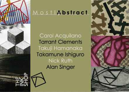 This is a review I wrote before starting this blog. The show, which is in downtown Ithaca, is up until the 27th. I've added some relevant hyperlinks and done some minor editing. Otherwise, the piece is unaltered.
Abstraction, while hardly new, plays an important role in contemporary art. The prints in the show "Mostly Abstract", currently on display at the Ink Shop, make a good case for both the vitality and diversity of contemporary abstract art. As indicated by the title, this show does not (at least when taken as a whole) take a purist approach. Abstraction here provides a set of metaphors for understanding the world around us. This impression is fostered by the human scale and considerable craftsmanship of all of the works, as well as the overt iconography—which never seems forced or incoherent—used in some of the pieces.I'll try to get pictures of some of these artworks up.
The most immediately striking work, due to its vivid colors and energetic forms, is a set of monoprints by Alan Singer. Singer uses a technique that combines digital and hand-painted (analog) mark-making. Twisted grid shapes, ribbons, polyhedra and other hard-edged forms are combined with dynamic scrawls and painterly smoke. His color is vivid: yellow, blue turquoise, pink, red, black, and yellow ochre, among others. Evocative of music (one of the pieces is dedicated to composer John Adams), these prints could also serve as stage sets for a futuristic play. My favorite is "Event Horizon" with its yellow and black striped "tree" and (elegant) cacophony of forms.
More subtle, but just as strong, are woodblock prints by Takuji Hamanaka and black and white intaglio prints by Nicholas Ruth. Hamanaka contributes three "Map in the Sky" pieces, which have turquoise, green and yellow backgrounds respectively. These reference airline route network maps, with their independence from earthbound geography. Also by Hamanaka is a "Zigzag Spiral", composed of a series of bandage like strips which get progressively darker as they move inwards. Ruth's pieces also look to the sky for inspiration. Each of his pieces uses three similar or identical cloud motifs, stacked vertically, as a point of departure for various improvisations with tone or line. Since the two larger pieces are displayed in the Ink Shop's main working space, and the three smaller ones in the separate (smaller) gallery space, one is encouraged to go back and forth, studying these variations—both subtle and not so subtle.
Also interesting are a series of carborundum collographs by Tarrant Clements. These pieces, in color and/or black and white, combine lattice-like shapes with softer plant or animal-like forms (sometimes this distinction is blurred). They suggest a melding of flesh and bone, or plants growing on an architectural structure. Carol Acquilano's work, while somewhat similar to Clements', is more varied in color, texture and pattern. Often, this variation occurs within a single piece, with sometimes arbitrary results. Her strongest piece is her simplest, the descriptively titled collaged carborundum print "Green Red".
Takamune Ishiguro's work has the opposite difficulty from Acquilano's, it seems too safe. His etchings combine scratchy dark marks with subtlely colored backgrounds of greens, blues and browns. The nuanced buildups of light and dark tones, while skillfully executed, do not command as much attention as other works in the show. Perhaps his most interesting piece is "Some Fragments VII-A", with its suggestion of a paper sheet (within the sheet of the print itself), its upper-right corner curling.
This is a strong show, both for its individual pieces, and for its juxtaposition of differing artistic sensibilities. Even the relatively weak work does not derail the efficacy of the whole. People unfamiliar with contemporary abstraction will get a useful, although (inevitably) incomplete overview. Those more knowledgeable will be able to appreciate the combination of historical awareness and individualistic approach evident (to a greater or lesser extent) in each of these prints.
Labels: printmaking, reviews
posted by arthur at 7:30 PM
0 comments


