Sunday, February 26, 2006

Saltonstall Salon

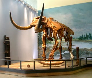
Today, I attended the second installment of the Saltonstall Foundation's new Art Salon series, which takes place at the Museum of the Earth, a natural history collection. The striking, angular building, filled with fossils and artwork depicting long extinct lifeforms, was a fun and offbeat locale for discussions of contemporary artists and their work. I got there early, so I got a chance to wander the museum, which I hadn't been able to do at the first Salon. The recently discovered Hyde Park Mastodon, almost (95%) complete, was impressive. (If you want to, you can sponsor one of the bones.)

There was light food, coffee and tea, set up by the catering people. I'm not sure what the numbers were, but I think that there were substantially fewer visitors than last time. Perhaps the weather, which was cold and windy? There were four speakers; each was supposed to talk for ten minutes, although this wasn't rigorously enforced. Many of them were quite awkward as public speakers, which seems to be the case with many visual artists (and something that I certainly identify with myself). Each artist was introduced by Laurel Guy, director of the Foundation. All brought samples of their work, and stayed around after the formal talks to chat with visitors.

First to speak was Virginia Cobey, who showed landscape paintings, as well as "abstracts". (This latter usage is probably out of date, and I have to say that I find it awkward.) She described her working schedule: plein-air landscapes when it is warm out, abstractions in her studio during the wintertime. Her emphasis was on the formal aspects of her work: selecting a composition from nature, building contrasts of shape and tone, establishing unity, and so forth. Much of this seemed generic (not particularly specific to her own work), and the talk was for the most part pretty dry.

Craig Mains, my favorite artist of the group, spoke next. Mains had a solo exhibit of his work at the Ink Shop last fall, and another one at Gimme Coffee earlier this year (an show from 2004 is reviewed colorfully here). Particularly nervous, he warned the crowd that he might suddenly stop talking (which luckily didn't happen).

First, he discussed his symbolic approach, which incorporates icons of disaster and flux (or icons in flux). Houses, trailers, ice-cream trucks, telephone poles, trees, Cessnas, helicopters, and more suffer the ravages of wind, fire and flooding. He noted the human attraction to such chaos and destruction, which he wants to separate from the human tragedy that usually accompanies it in the real world.

He also discussed his technical process, which has unusual aspects. He applys wet media (usually watercolor) to porous acetate sheets, which he can run through a printing press. Often, he cuts his iconic forms out, arranging and rearranging them. Although the monotype process is meant to produce a singular, unique image, Mains reuses these cutouts in further images, in which they grow progressively fainter as the pigment fades. Images and their "ghosts" are used to form series. He also talked about his use of Internet search engines as a source of imagery, which sometimes produces unexpected but useful juxtapositions
—for example, a search for "high tension wires" producing an image of a downed helicopter.

Bill Roberts, who teaches at Wells College, talked after Mains. He spoke engagingly about his life history, but didn't have too much to say about his current painting, a series of "shaped" (non-rectangular) pieces inspired by Elizabeth Murray's work. These pieces, done mostly in pinks, blues and whites reference the notorious "dimpled chads" from the 2000 election, which seemed like a pretty forced attempt at humor. Some of his earlier work, reproduced in catalogs he was giving away, looked more interesting. He also spoke about his work as a sports photographer (football and horse racing), and his love of Spain and its culture and art.

His philosophy of teaching was presented as a series of cliches, likely familiar to anyone who has attended art school: be spontaneous, experiment, be willing to fail, value the process of making art over the results, be fufilled in life. (He reminds me of a particular teacher I had in art school about whom I have very mixed feelings.) I don't know if Roberts is a good teacher or not, but I personally don't find these truisms very useful or encouraging.

Linda Swanson, a ceramic artist currently attending grad school at Alfred University, was the last to get up. Her work, inspired by the landscape of Iceland, uses natural processes such as dripping, cracking, and the formation of crystals, which act in unanticipated ways. Unlike the other artists, she read from notes for much of her talk, which gave it an strangely academic tone, seemingly out of place. She spoke of an interest in referencing the geological and the biological, different scales, mapping the landscape. The difference between science and art is important for her; the latter allows for things to be "other than what they are", which is a nice way of putting it.

Swanson showed two circular porcelain pieces, meant to be hung on a wall, although they were shown on a table instead (due to a lack of set-up time). The pieces were coated in thick layers of glaze, which were deliberately allowed to crack. One was white, black, and red, and the other (my favorite of the two) a pond-like green, with white crystal growths. The pieces receded behind their metal frames.

The quality of both the artists' talks and their work (which seem to correlate), was more uneven than at the first Salon, which is too bad. Still, it was an enjoyable event. I'm looking forward to the next one, which takes place on March 26.

Labels: ,

Thursday, February 23, 2006

Art in NYC

I spent most of Monday and Tuesday in New York City, walking around Manhattan, and looking at an astonishing variety of art.

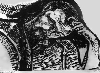
On Monday afternoon, I went to MoMA, which seemed insanely crowded. I didn't have the time to see any of the big special exhibitions, but I did see a neat little show of etchings, which contained likeable works by artists as diverse as Sol LeWitt and James Ensor (including this piece). There were also intricate etchings by the great James Siena, who lectures at Cornell on March 7th. The next day, I went to the Met, where I saw the incredible retrospective of Rauschenberg combines (more on that later).

Tuesday, I also had a few hours of desultory gallery-hopping in Chelsea, which felt cold
(both literally and figuratively). I was disappointed by most of what I saw, more so than usual. Here are few highlights, reflecting my own idiosyncratic tastes and responses rather than any kind of systematic judgment.

Lucky de Bellevue's colorful chenille (pipe-cleaner) mounds filled the main space at Feature Inc. These web-like pieces were either suspended from the ceiling and/or walls, or attached to various found-object bases (one loosely figurative work was resting on a cane). He has this to say about his art:
I think this humorous conflict is implicit in my work: the beautiful/grotesque, the abject glamour, the materials, and sometimes the titles. When I first started doing this type of work, there was a bit of a "fuck you" attitude in my mind about it and, although there are still elements of irony I am much more sincere about it moving dangerously close to total sincerity.
Roxy Paine's show of sculptures at the Jam
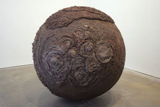
es Cohan Gallery, although (as usual) diverse in approach, was brought together by his interest in blurring the distinction between art and nature. Although the centerpiece of the show was probably the life-like Weed Choked Garden, my favorite piece was the strange, fungal Bad Planet (see above, also here for a detail). Also notable was Erosion Machine, a laptop controlled blasting device, gradually working on this landscape. Unfortunately, it wasn't running while I was in the gallery.

Here is a fairly unsympathetic review of the show
—the pieces "offer a kind of Madame Tussaud's experience for the artworld". That might be true if Paine did just the hyperrealistic pieces (he has also done mushrooms). However, seen in the context of his other work, it would be misguided to simply stand back in awe of their verisimilitude (although this is part of their appeal). In particular, this is true because his machine-made abstractions also have a life-like, "natural" quality to them. So, I think you need to reconsider the dualism of realism vs. abstraction, as well as that of art vs. nature. None of this is "conceptually neat" at all, and most of it is fun to look at too.

Thomas Nozkowski's small, stylistically varied abstract paintings were up at Max Protech. I thought the hanging was sparser than it needed to be
—his work benefits from clustering. The pieces were more or less interesting. I particularly liked his Untitled 8-67, with its wispy blue background and its accumulation of candy colored tounge forms. Here is a recent interview.

Labels:

Thursday, February 16, 2006

Mostly Abstract

This is a review I wrote before starting this blog. The show, which is in downtown Ithaca, is up until the 27th. I've added some relevant hyperlinks and done some minor editing. Otherwise, the piece is unaltered.
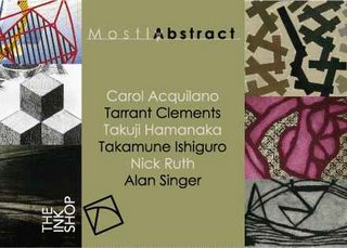
Abstraction, while hardly new, plays an important role in contemporary art. The prints in the show "Mostly Abstract", currently on display at the Ink Shop, make a good case for both the vitality and diversity of contemporary abstract art. As indicated by the title, this show does not (at least when taken as a whole) take a purist approach. Abstraction here provides a set of metaphors for understanding the world around us. This impression is fostered by the human scale and considerable craftsmanship of all of the works, as well as the overt iconography—which never seems forced or incoherent—used in some of the pieces.

The most immediately striking work, due to its vivid colors and energetic forms, is a set of monoprints by Alan Singer. Singer uses a technique that combines digital and hand-painted (analog) mark-making. Twisted grid shapes, ribbons, polyhedra and other hard-edged forms are combined with dynamic scrawls and painterly smoke. His color is vivid: yellow, blue turquoise, pink, red, black, and yellow ochre, among others. Evocative of music (one of the pieces is dedicated to composer John Adams), these prints could also serve as stage sets for a futuristic play. My favorite is "Event Horizon" with its yellow and black striped "tree" and (elegant) cacophony of forms.

More subtle, but just as strong, are woodblock prints by Takuji Hamanaka and black and white intaglio prints by Nicholas Ruth. Hamanaka contributes three "Map in the Sky" pieces, which have turquoise, green and yellow backgrounds respectively. These reference airline route network maps, with their independence from earthbound geography. Also by Hamanaka is a "Zigzag Spiral", composed of a series of bandage like strips which get progressively darker as they move inwards. Ruth's pieces also look to the sky for inspiration. Each of his pieces uses three similar or identical cloud motifs, stacked vertically, as a point of departure for various improvisations with tone or line. Since the two larger pieces are displayed in the Ink Shop's main working space, and the three smaller ones in the separate (smaller) gallery space, one is encouraged to go back and forth, studying these variations—both subtle and not so subtle.

Also interesting are a series of carborundum collographs by Tarrant Clements. These pieces, in color and/or black and white, combine lattice-like shapes with softer plant or animal-like forms (sometimes this distinction is blurred). They suggest a melding of flesh and bone, or plants growing on an architectural structure. Carol Acquilano's work, while somewhat similar to Clements', is more varied in color, texture and pattern. Often, this variation occurs within a single piece, with sometimes arbitrary results. Her strongest piece is her simplest, the descriptively titled collaged carborundum print "Green Red".

Takamune Ishiguro's work has the opposite difficulty from Acquilano's, it seems too safe. His etchings combine scratchy dark marks with subtlely colored backgrounds of greens, blues and browns. The nuanced buildups of light and dark tones, while skillfully executed, do not command as much attention as other works in the show. Perhaps his most interesting piece is "Some Fragments VII-A", with its suggestion of a paper sheet (within the sheet of the print itself), its upper-right corner curling.

This is a strong show, both for its individual pieces, and for its juxtaposition of differing artistic sensibilities. Even the relatively weak work does not derail the efficacy of the whole. People unfamiliar with contemporary abstraction will get a useful, although (inevitably) incomplete overview. Those more knowledgeable will be able to appreciate the combination of historical awareness and individualistic approach evident (to a greater or lesser extent) in each of these prints.
I'll try to get pictures of some of these artworks up.

Labels: ,

Wednesday, February 15, 2006

Two Views of Yangtze Remembered

Here are two articles on the Butler show: an interview with the artist by Nancy Geyer in this week's Ithaca Times, and a piece by Whine del Rosario written for the Cornell Daily Sun.

Geyer's piece contains some evocative descriptions of individual photographs, as well as useful and interesting information about the experiences of the artist and her human subjects. Butler describes her artistic approach as well. She admits that she "had to give up
taking meditative images that are my signature to focus on the rapidly changing environment". Her new approach, she claims, was "more spontaneous and more intrusive" than with her previous projects. While her landscape images do indeed depict such an environment, there is also a stillness and formal quality to most of them that does seem "meditative" (calm, patient) to me. Even most of the images prominently featuring people do not seem all that spontaneous. Many are clearly stagedas with the before and after shots of Mr. Tan mentioned by Geyeror seem to involve considerable deliberate effort to be in a particular place at a particular time.

Del Rossario is more interested in examining the photographs from the viewer's perspective, an important issue that Geyer doesn't really address. Unfortunately, her writing is sometimes awkward, particularly in its choice of words. Also unsatisfying is her attempt to integrate a heavy-handed philosophical approach into a basically journalistic framework. For example, she claims of the photos that "they compose a way of access into the being of an otherwise intimidating topography". She does make some intriguing claims about the photographs' character. She argues for their subjective, artistic and non-polemical character and against a straightforwardly documentary interpretation. These ideas are potentially interesting, but presented in a way that seems less than fully coherant.

I've found another Sun article, one focusing on the talk rather than the exhibit. There are some remarks by Cornell engineering students.

Labels:

Sunday, February 12, 2006

Linda Butler

As I mentioned, last Thursday evening I attended a lecture by Linda Butler at Johnson museum. Her show of black & white photographs, documenting China's monumental Three Gorges Dam project, is on display there through March 26th. The exhibit, made up of images sampled from her book Yangtze Remembered: The River Beneath the Lake, is traveling around the country. (Here is a radio interview in which she covers many of the same topics as she did last week.)

The engineering project, as she told us, is meant to serve three purposes: to provide hydroelectric energy, to help shipping, and to control flooding problems. She emphasized that it will help certain commercial and government interests at the expense of many others, particularly the locals. It is intended for completion in 2009, and she plans to return to China for a set of follow-up pictures.

I was impressed by her even-handed approach to the politics of the project, both in her talk, and more subtly in the variety of her photographic subjects. There were three broad themes: the grandeur and feeling of timelessness conveyed by the natural landscape, the perseverance of the local people and their cultural traditions, and the relentless force of modern development. The selection of pictures conveys the appealingness of each of these individual themes, but also the (aesthetic, moral, and political) ambiguity of the overall situation. It seemed clear from her talk that her main sympathy was with the local people and the land. Her actual depictions of new development however
pictures of large scale engineering sprawl and model-like (as she pointed out) "new cities", are often quite beautiful. By way of contrast, a picture showing the facade of a squalid apartment building shows the harmful (if picturesque) side of the old cities. Indeed, she spoke of a real need for modernization. However, she stressed that the Chinese government needed to take greater care, so as to minimize the displacement of traditional ways of life and the degradation of the environment.

Butler also talked briefly about the technical aspects of her project, mentioning her use of a digital camera to take "sketches" for more polished work, done mostly with film. She showed samples of these
some in coloremphasizing their lack of unusual ("artistic") perspective. Failing to spark debate, she admitted to doctoring an image using Photoshop, potentially controversial in work with a apparently documentary purpose. She said she wanted to remove the atmospheric distortiona product of rampant air pollution as well as mist and fogso as to more closely match what she claimed was her own subjective view of the scene. I suspect she has some reservations about placing her work in a documentary tradition. (Although mostly self-taught, she was introduced as a student of Ansel Adams, probably best known as an artistic landscape photographer.)

Labels:

Friday, February 10, 2006

Thinking?

If anybody is interested, the title of my blog is stolen from a book of writings by Paul Klee, who happens to be my favorite artist. I should confess that I haven't read it (it is out of print), but that doesn't lessen its suitability for my purposes. The combination of visual and conceptual rigor implied by the the titlealso manifest in Klee's amazing body of worksets an (impossibly) high standard for my own efforts.

Labels: ,

Thursday, February 09, 2006

Eye Opening

I've been meaning to get thing this up for a little while now; my goal here is to create a record of my changing ideas and opinions about the visual arts. I am a painter (look here if you don't believe me), a graduate of the School of the Museum of Fine Arts in Boston, and an aspiring art writer. I am currently living in Ithaca, somewhere in upstate New York.

This blog is intended for two distinct (if overlapping) audiences: a local one, as well as one involved with (or at least knowledgeable about) the broader field of contemporary art. Why write about art in a small town, isolated from the centers of the art world? Well, first of all, I believe that art is something that should be experienced directly (without excessive mediation) whenever possible. While I do read more than my fair share of books, magazines and web-based material pertaining to art, I can't imagine these being the sole basis for my writing here. Since I haven't been traveling much (although this will hopefully change), a local focus is probably inevitable. Secondly, I would like to make a contribution to local culture, both for idealistic and selfish reasons. There is a good amount of interesting art going on around here, but I think that the dialogue (among other things) could be strengthened. As Laurel Guy, Program Director at the Constance Saltonstall Foundation says in this article,
"there are a whole bunch of small cells all over the place, because people find like-minded people, and in that sense there is a community - but there's no arts center." The article is nearly two years old, but the main point seems to me still largely valid, this despite the Foundation's own worthy efforts, which continue. Actually, I think there should be multiple art centers. One of my goals for this blog is to become one such center, so anybody who shares these local-minded goals is welcome to respond. (Needless to say, everyone else should feel free to do the same.)

Anyway, I hope to start posting here regularly. On Thursday evening, I attended an artist's talk given by the photographer Linda Butler at the Herbert F. Johnson Museum of Art. She has work up there vividly illustrating the Three Gorges Dam project currently underway on the Yangtze River in China. I want to discuss both the talk and the show in some detail, and I've written quite a bit here already, so this will have to be a separate post.

Labels: , ,