schwitters kunst
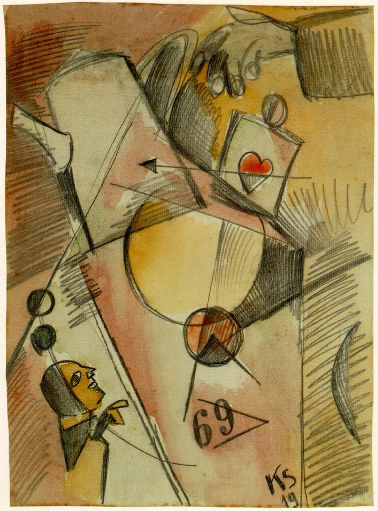
The Heart Goes From Sugar to Coffee, 1919
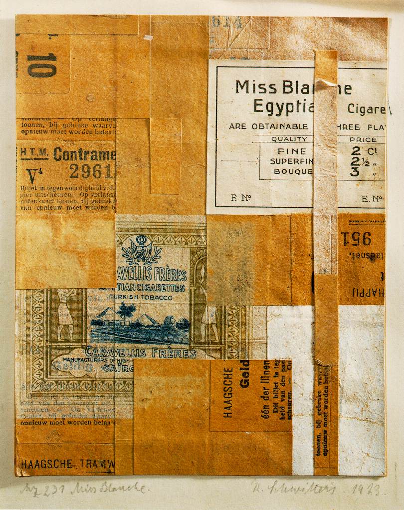
Miss Blanche, 1923

The Knave Child, 1921
Labels: collage, cubism, kurt schwitters
posted by arthur at 8:51 PM
![]()
Labels: collage, cubism, kurt schwitters
posted by arthur at 8:51 PM
![]()

5 Comments:
I hope all you people out there looking for Rauschenberg jpgs will like these!
I love these!
Jrmedia,
While I have great respect for Joseph Cornell, I strongly disagree with your stance on Schwitters. Its true that his sensibility, in the main, was far more formalist than Cornell's (and certainly graphic design related). But you're wrong in suggesting that their effect is straightforwardly decorative. In addition to his overtly symbolic and referential use of found pictures and text, his choice of materials and textures says much about the society he was living in.
Cornell's works are narrative and 'literary' in a much more traditional manner, one that relates closely to 19th century art. At their best, they do indeed posess great "wonder and mystery". At their worst, I find them mawkish and sentimental.
I appreciate you taking the time to express your artistic values. Clearly, my own are at least somewhat different.
Do you still believe that Schwitters' work is "a mere exercise in graphic design layout"? (I would argue that much of the above applies to his actual graphic design as well as his fine art.) If so, how is he "the great grandfather of pop art" as well? Is pop art graphic design too? I would argue that much of it is about graphic design, which is a bit different.
Your comments about Schwitters in relationship to his time period are astute. This expression of his time explains much of his appeal to me.
I can live with the failure of his "Wagnerian" ambitions, although it is an interesting historical claim. His small collages are exquisite.
I don't think that he was quite as tied to Constructivism as you suggest. His early paintings and collages (say before the twenties, I don't have a monograph in front of me) are more indebted to Futurism with Expressionist and Cubist inflections. The compositions are
dominated by diagonals and the colors are dark and apocalyptic in feeling.
His work from the twenties (and probably the early to mid-twenties in particular) tend to be the most rigidly Constructivist (often eschewing even the painterly use of collage materials found elsewhere). Much of his later work incorporates more organic shapes (sometimes actual natural materials). They often tend towards a more overtly symbolic and even narrative quality. "Homage to Sir Herbert Read", which I mention in my review is a good example. Of course, the Constructivism remains a kind of frame.
As for Pop Art, I suspect that it was the collage work of Braque and Picasso that laid the beginnings of the foundation. They combined the formal dislocations of the avant-garde (following from Cezanne) with snippets from the new mass culture (newspapers and advertisements). Schwitters and other artists took both of these much further. Of course, as you say, these things are speculative.
I haven't seen enough of Cornell's work in person, although I read Deborah Solomon's biography of him a few years back.
Post a Comment
<< Home